In recent years, Corporation Pop has spent a lot of time supporting customers by improving their websites’ accessibility following the Web Content Accessibility Guidelines (WCAG). It’s something very close to our hearts as a design and development agency.
For us, design isn’t just about how a website looks but how it functions, its ease of use and readability. It’s important to make sure it’s inclusive to the widest possible audience. You simply don’t know who’s going to be visiting it. A user might have physical, visual or cognitive impairments and we want them to get the same quality of experience no matter how they interact with it.
So, how do you ensure that happens? Well, there’s a big, very technical list of guidelines called Web Content Accessibility Guidelines (WCAG). There are several versions of WCAG, the latest ratified version being 2.2. However, at the end of May 24, the World Wide Web Consortium (W3C) published a working draft of version 3.0.
Coming to this fresh, with a non-technical background can be daunting; it’s not the easiest guideline to decipher.
The big list
You may hear terms banded about like does it meet Double A, or Triple A? To simplify things, WCAG is the big list of things you should do and A, AA, and AAA are how well you are doing it. They are basically your ‘success criteria’.
Websites that meet all AAA criteria are obviously the most accessible, and in most cases the absolute hardest to achieve. For example, if you provide video content on your site, the guidelines expect you to have several things as standard. They include subtitles (closed captioning), a transcript, sign language interpretation and possibly audio descriptions depending on the type of content. As you can guess, for anyone producing content, even if they wanted to provide them, it adds a budgetary burden. Often this would mean meeting this level was unachievable.
As it stands, most UK public sector and government websites are required to meet AA levels on all criteria. That’s usually what we aim for on most sites we build. It’s still quite a task, but it’s the right thing to do for your users isn’t it? Whomever they may be.
The four principles
The most recent guidelines focus on the importance of four key design principles, or themes. They encourage you to think more widely about how the user will interact with the content you provide. They also focus less on specific technologies and encompass touchpoints for designers, developers and authors.
The themes or principles are:
- Perceivable
- Operable
- Understandable
- Robust
So… Does your website visitor use a screen reader or a touch device without fine grained control like a mouse? Maybe they are just using a keyboard. Have they zoomed in to make the text larger? Do they read/speak a different language to the one provided?
These are questions, raised by the criteria, which we should make sure we have answers for.
We thought it would be useful to take these principles and simplify the key criteria we encounter the most. We’ll break them down into less technical terms with examples as we go. We may go into more detail on some at a later date, but that’s one for another blog post.
Perceivable
This principle centres around making the web content you provide on the page available to all the senses. Specifically sight, hearing, and/or touch.
Providing text alternatives (‘alt text’) for any non-text content
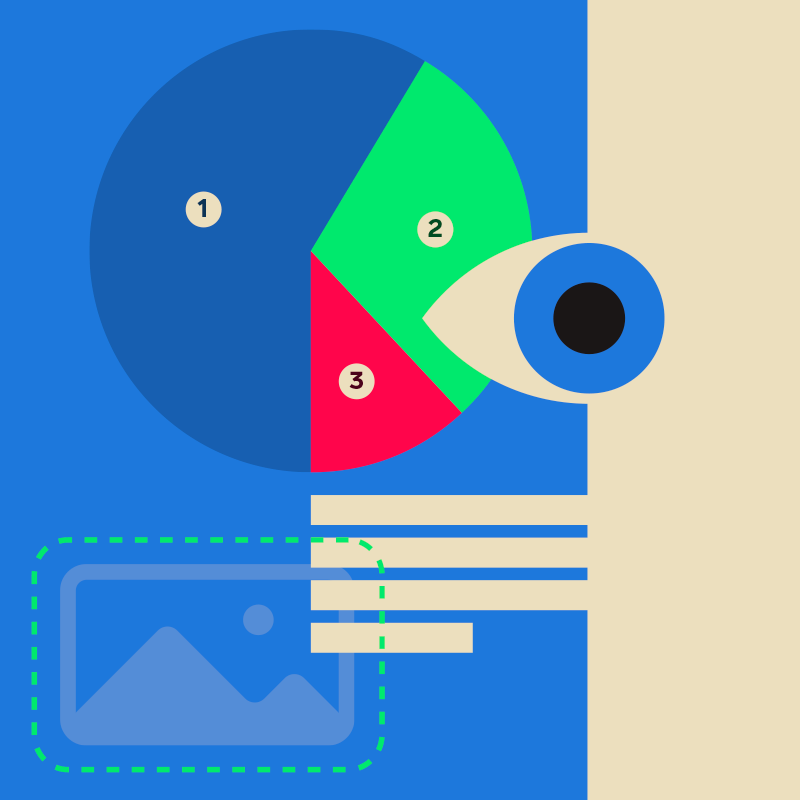
If you’re using a photo, properly describe what’s going on in it. If you use a graph, also show the data in a <table>.
If the image has text in it, ensure you capture all the text in the alternative. Or, better still, don’t use it at all. Make it text in the document.
The only exception here is for images that add no value and are ‘decorative.’ In this case it’s better to leave them without an alternative so screen readers don’t announce them.
Providing transcripts for audio and video along with captions (CC) for video
This can even be a separate HTML page, so long as it’s logically linked for the user.
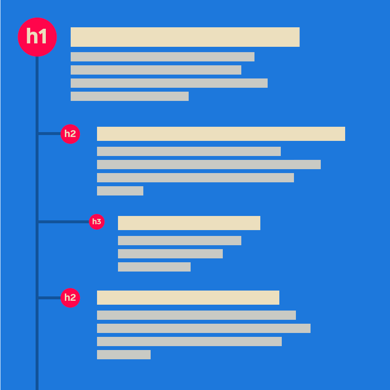
Making sure your content is in a logical sequence and code is used correctly to reinforce relationships and information conveyed through presentation
Make sure your markup is semantic. Use appropriate tags to identify regions of a page and put it in a logical order in the code.
Put your navigation in a <nav> tag, if it’s the main navigation that might go inside the <header> tag. Your main content? That goes in <main>. Some supporting content but something not strictly related to the main content, that goes in an <aside>.
Is it logically ordered? A great test for this is to disable CSS. If your document reads rationally from top to bottom without it, that’s a win.
To reinforce relationships, for example, if you have a pricing chart, use <table> markup to present the structure in code. Meaning headers for corresponding row or column data can be easily programmatically determined via assistive technology.
Not using colour alone to explain or highlight something
Not everyone can see or distinguish colours. Example: Got a form input error?
Yes, certainly use a nice red border to distinguish it.
But also provide text next to it as to why it’s an error.
Bonus points if that text has extra info available to help the user correct the issue.
Using text colours that show up clearly against the background colour
This is all about colour contrast, so make sure there is enough for text to be easily readable. It should be at least 4.5:1 for normal text and 3:1 for large text. This warrants a blog post in itself but we’ll leave this here for now.
Making sure your site is responsive
Make sure the site properly adapts to the device it’s shown on. Ensure everything still works and re-flows correctly when you increase text size or zoom the browser, usually up to 200% in each case.
Operable
This principle is about making sure the interface, forms, controls, and navigation are operable. This should be regardless of the way the user is accessing it (for example with a keyboard only). Do this by:
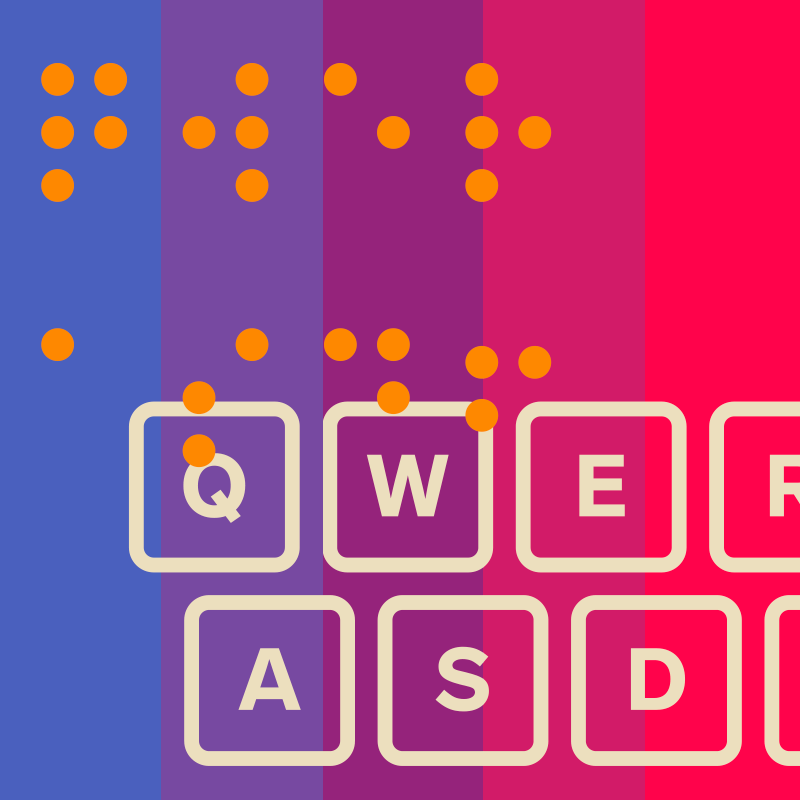
Making sure everything works for keyboard-only users
Users can successfully control interactive elements using the keyboard without any focus traps.
Letting people pause and play any moving content
Video content (or sliders with auto-play for example) need to be able to be paused.
Not using flashing content or have the ability to let the user disable animations
If you have animations, ensure they run for no longer than 5 seconds, do not flash and only run once.
Bonus points for having the option to disable them completely. (The prefers-reduced-motion media query is excellent for this but let’s not dig too deep…)
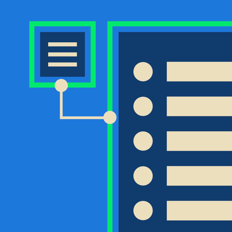
Provide a ‘skip to content’ link or equivalent navigation aid
For example, provide users a way to skip directly to the main page content avoiding that hefty main navigation list. For multiple sectional nav’s, or less relevant content, perhaps implement multiple skip links to move around the document more easily.
Use descriptive titles for pages and frames
This may be obvious but title your pages according to the content it contains. If you are using any embedded content (like an iframe) ensure you also title it accordingly.
Make sure users can navigate content in a way that makes sense
Similar to the logical structure in the perceivable principle, make navigating content fully logical for the user. If, for example, you need to load additional content on a button press (like more articles) make sure users’ focus shifts back to the first newly loaded article. This way the user knows where they are in the page.
Use descriptive links so users know where a link will take them, or what content they will download
Basically, don’t use ‘read more’ or ‘click here’! Craft link text with purpose and use text that can be meaningful outside of the context it’s viewed. The WCAG has a great overview about writing meaningful link text if you want to know more (see what we did there). If you’re offering a download inform users of the file format, its content and preferably the file size.
Make sure users using assistive technology or a keyboard are aware of what they are currently actively focused on
Don’t remove default outlines for focused elements, so it looks nicer. If you need to introduce clearer or more custom focus states ensure they are really obvious with good contrast ratios.
Use swiping or dragging actions only when they’re necessary — or with alternate controls
Got a swipeable carousel? Nice isn’t it? Let’s keep that interaction as a progressive enhancement. Introduce a next and previous button that users can easily access with the keyboard or a single press. Or we could have pagination dots which navigate to the indicated slide on click (or all three).
Make sure interactive elements such as buttons are big and spaced far enough apart to make them easy to press
There’s a few differing guidelines as to what this should be. Officially, to meet AAA, you are required to use a minimum of 44px square but only 24px square for AA.
For us, our rule of thumb (literally) is to use a minimum of a 35-40px square on buttons. We then place them at a minimum of 10px apart.

Understandable
This principle focuses on making sure the Information and the operation of the user interface is understandable. More so by the user rather than the technology. We do this by:
Making sure you clearly state the language of the content
And if it changes at any point, also show that change.
Building features with consistent behaviours that react in predictable and expected ways
Being consistent with your user interface patterns across the entire site.
Ensuring forms are simple to use
Make it easy for users to submit data by providing feedback on errors and suggesting corrections. Having forms with correct markup fields, and correct and meaningful labels. Then, if they need to re-enter data, make this as easy as possible.
Robust
This principle centres around ensuring content is robust enough that a wide variety of user agents can interpret it reliably, including assistive technologies. This leans more to the technical rather than the user by:
Making sure you use markup in a way that facilitates accessibility
This includes following the HTML specifications and semantics with components/tags all used appropriately. Then, when HTML is not sufficient, ARIA (Accessible Rich Internet Applications) is used appropriately to enhance accessibility.
Making sure alert messages are accessible to screen readers
If a website presents an important status message, and focus is not set to it, it must announce it to screen reader users typically via an ARIA alert or live region.
Not complicated is it? ; )
When it comes to meeting accessibility standards, this is just the tip of the iceberg. Whilst this is not a comprehensive list, we hope this article highlights the most important aspects to consider. These will help get your website to AA standard, in an easier to understand and less technical jargon heavy way.
There’s a lot more information on specific areas we’ve purposely had to stop ourselves deep diving into. If we hadn’t, this article would easily be triple the length. We could ramble on for hours, about tools, testing alongside design, and technical approaches. It was very tempting to do so, so keep an eye out.
Further reading
In the meantime, if you want to keep reading there are some excellent resources about meeting WCAG conformance for designers, developers and authors over on the main website.
Here’s the full Web Content Accessibility Guidelines (WCAG) 2.2. This is a (not so) quick reference to meeting the WCAG guidelines. And here is a superb checklist you can filter success criteria against WCAG version and level against on WebAIM website.
We highly recommend checking out the A11Y Project, a fantastic community effort to make digital accessibility easier. It has a vast archive of resources to delve into. And if you just want to be emailed fantastic information weekly, consider signing up for the A11YWeekly newsletter.
Finally, we’ll ponder what a follow-up article may look like and you go make those improvements; we should all be doing this.
And, if you want our help to do it, you know where we are.
If you’re looking for help with website accessibility, for either a new or existing site, get in touch with Martin for a chat. He’ll be happy to talk you through how we can work together to ensure everybody using your website has a five star experience.
Get in touch