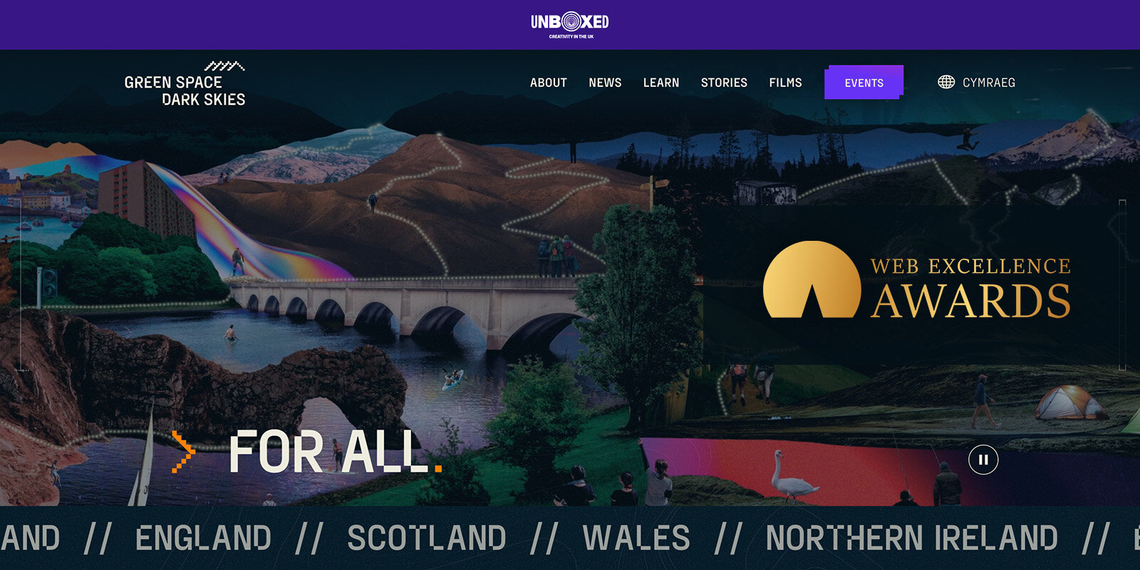
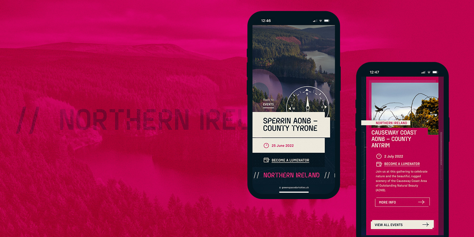
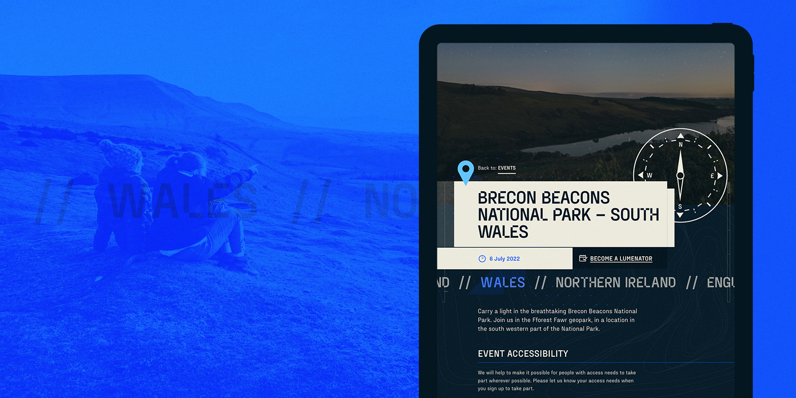
The Web Excellence Awards has named Corporation Pop as Gold winners in both the Accessibility category and the Cultural category
Corporation Pop has always put online accessibility front and centre when designing and building websites and apps. It’s important that as many people as possible have the best online experience they can, and of course, it makes good business sense to be as inclusive as possible.
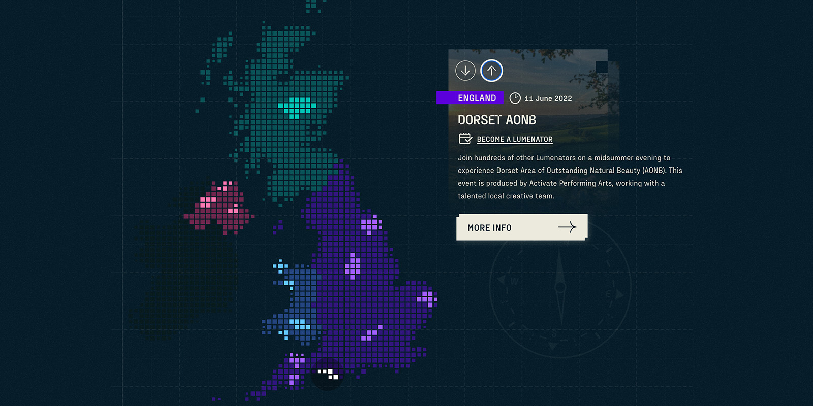
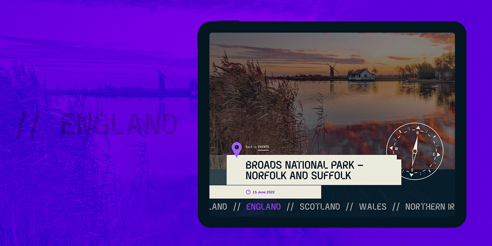
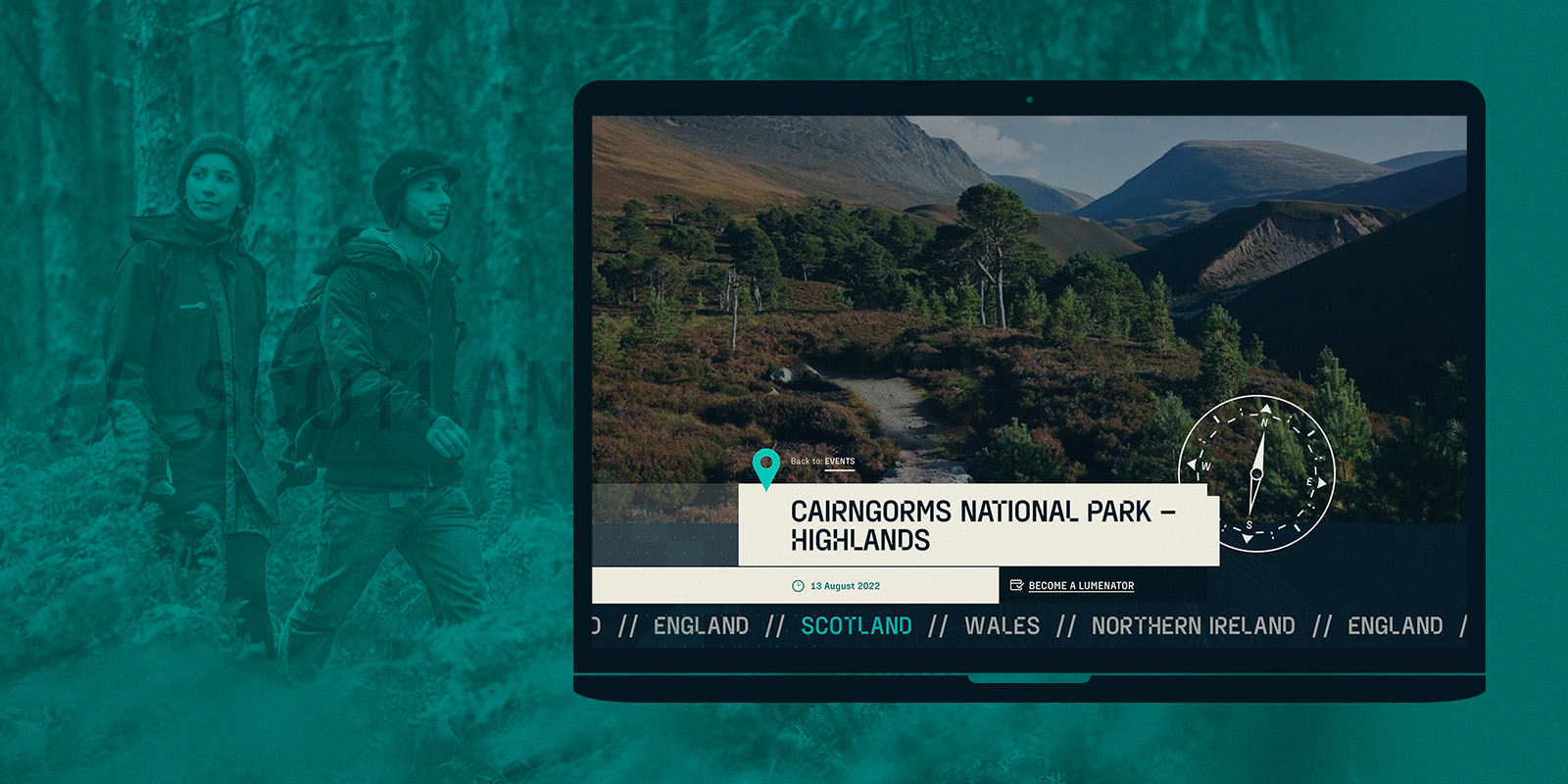
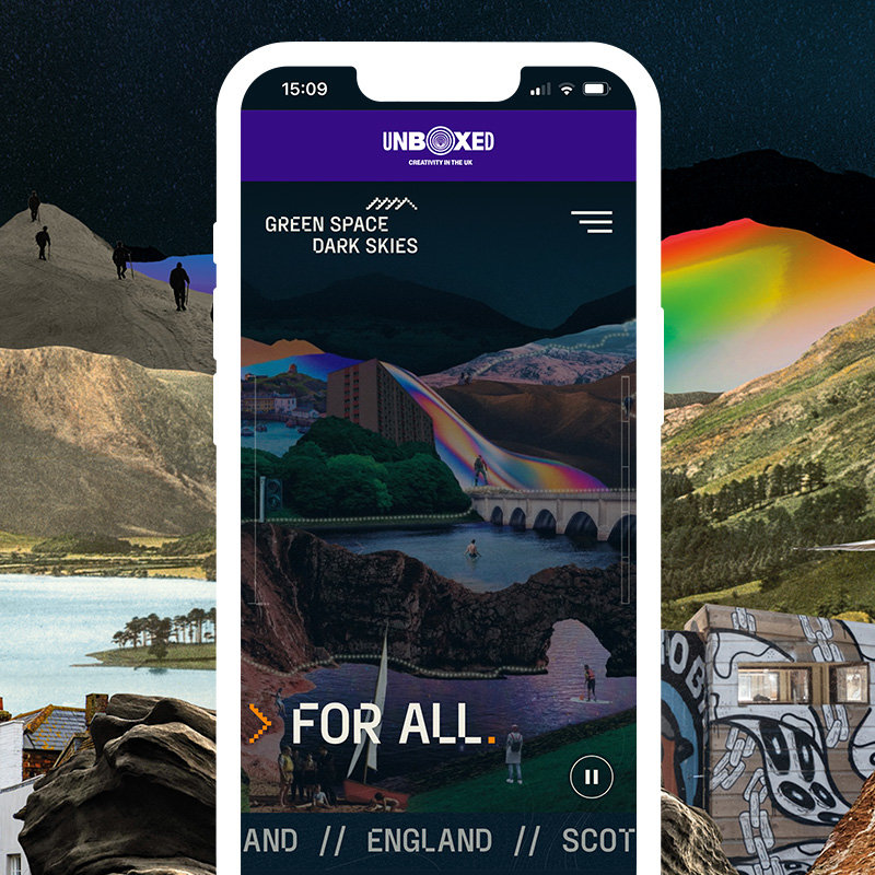
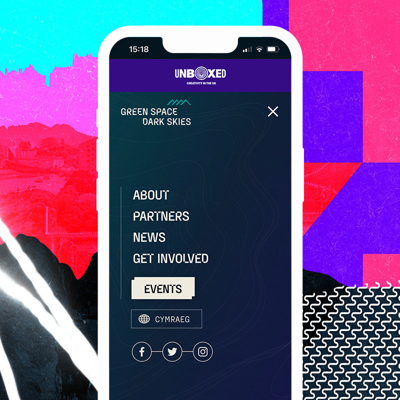
You can imagine how pleased we were then to have our efforts acknowledged in a recent project with Walk The Plank, the Salford based outdoor arts organisation responsible for the production of Green Space Dark Skies.
This kind of industry recognition is important to us as it acknowledges the quality of Corporation Pop’s output; highlights how committed we are to working closely with our clients to deliver their brief; and is evidence that we stand by our principles when it comes to accessibility.
Aligned values
Naturally the team behind the website at our end were chuffed to bits when we heard the news. When asked about how we approached the Green Space Dark Skies website, Dan, Corporation Pop’s MD, said:
‘We had a pretty intimate relationship with Walk The Plank from the outset and were in almost daily contact. Between us we defined the full scope of the project, from initial information architecture right through the design and build phase, to our package of ongoing support.
It was wonderful to work with an organisation that values accessibility as highly as we do. Because of that, it was easy to stick to accessibility best practice whilst keeping true to the overarching brand design.
Throughout the project we were able to facilitate multiple rounds of user testing and update the website based on feedback. It was amazing to have a chance to deliver such high standards in accessibility on what I hope people will agree is a beautiful, hard working website’
Award winning
We’d like to thank the Web Excellence Awards for putting a smile on our faces, Walk The Plank for being brilliant clients, and our friends at Instruct Studio who created the initial branding. If you’ve not seen it yet, take a look at the highly accessible Green Space Dark Skies website here — we’re very proud of it — and you can find out more about the project here. Finally, if you’re interested in accessibility, you can read an interview with Corporation Pop’s Design Lead, Martin, here.
