Falls cost the NHS more than £2 billion a year. KOKU Health was built to reduce that burden: an app that guides older adults through a 12-week programme of strength and balance exercises, while tracking usage, engagement and self-reported health outcomes.
The data KOKU collected was rich. The problem was making it legible to the people who commission falls-prevention services. Commissioners needed to understand who was using the app, how they were engaging, and whether engagement appeared to relate to outcomes. They needed to be able to filter results, compare groups and export evidence to share with colleagues, boards and budget-holders.
Corporation Pop designed and built a falls prevention data dashboard that does that.
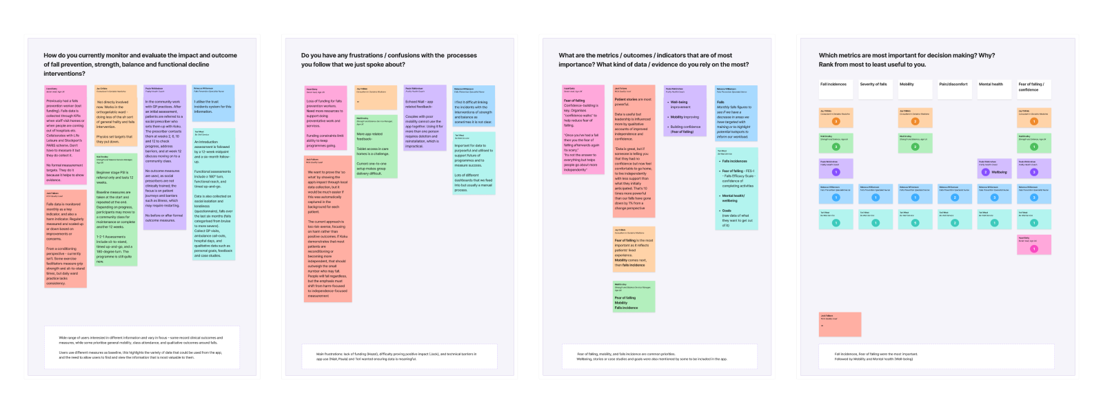
User Interviews and research
Getting the scope right
Before any design work started, we needed to understand what different users actually needed from the data. We interviewed commissioners and service delivery professionals across falls prevention, frailty, geriatric medicine, quality improvement and community wellbeing.
The research confirmed that different roles measure success differently. There was no single view of the data that would work for everyone. The dashboard had to give users a structured overview and let them explore the metrics most relevant to their context.
It also told us that the most important outcome measures — consistently, across every interview — were falls incidence and fear of falling. Mobility and mental health came next. Those findings drove our prioritisation.
We used MoSCoW analysis to define what the first build would and would not do. The scope covered usage and engagement data, demographic breakdowns, programme progression, falls and injury data, fear of falling, self-reported wellness measures, and reporting and export functionality. Individual user data, report builders and written summaries were valuable ideas, but they belonged in a later phase and some depended on future changes to the app itself.
Getting that boundary right mattered. A falls prevention data dashboard that tried to do everything in phase one would have been slower to build, harder to use and less useful at launch.
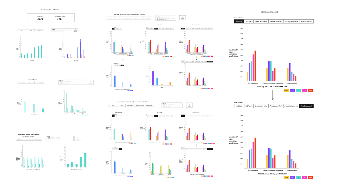
Process sketches
What the dashboard does
The dashboard is structured around the questions commissioners are most likely to ask:
Who is using KOKU?
The user section gives a high-level view of demographics and engagement: total users, active users, age and gender breakdowns, exercise intensity, engagement levels and programme progression.
What are the outcomes?
The outcomes section lets commissioners explore data by engagement level or exercise intensity, across falls, fear of falling, injury type and severity, usual abilities and wellness measures. Fear of falling can be broken down by specific daily activities: dressing, bathing, sitting and standing, stairs, reaching, slopes, walking on uneven ground, social events.
How does engagement relate to outcomes?
This was the hardest design problem. KOKU is a 12-week programme, but users follow it at different rates. Some complete it. Others stop earlier or dip in and out. The dashboard needed to support baseline, six-week and twelve-week comparisons, as well as more continuous views over time — without making that complexity confusing to navigate.
Can the evidence be shared?
The report section lets users select charts, apply filters, preview the report and download it as PDF or CSV. Commissioners need evidence they can put in front of colleagues, boards and budget-holders. That meant the reporting function had to be a first-class feature, not an afterthought.
Throughout, contextual help panels, chart keys and tooltips explain what users are looking at. The engagement definitions and exercise intensity categories that underpin the data are accessible without leaving the page. Complex data is useful only if people can interpret it correctly.
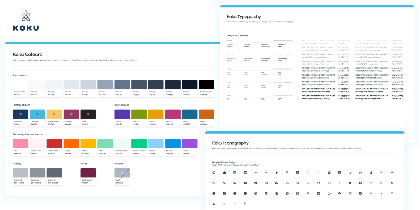
KOKU design system
Development
The frontend was built in React and Next.js. A Python API sits behind it. The finished product was packaged as a container image for deployment into Docker-based infrastructure.
We built and tested the interface against dummy data before the live connection was made, which meant the design, charts, filters and export functionality were all stress-tested in realistic conditions before any real user data was involved.
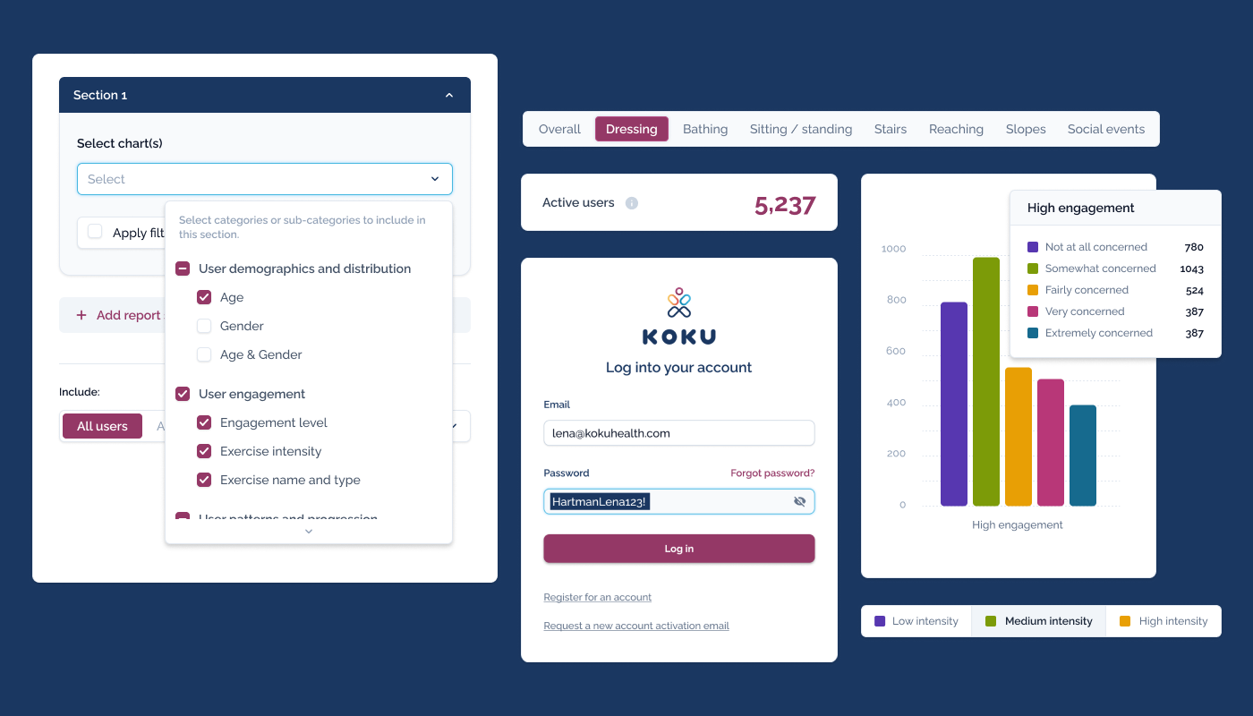
KOKU UI components
The result
The dashboard gives KOKU Health a credible, explorable view of their programme data. Commissioners can move from raw numbers to the questions that matter for decision-making: not just how many people are using the app, but who, at what intensity, over what period — and what the outcome data shows across those groups.
KOKU Health described the project in the following terms:
“The data this project was looking at was complex and required some workshopping to understand how best to view and digest the meaning. The team gave this their full attention, producing lots of different ideas and options. The finished product was exactly what we needed and was completed and handed over to an excellent standard.”
Victoria Bertenshaw, KOKU Health
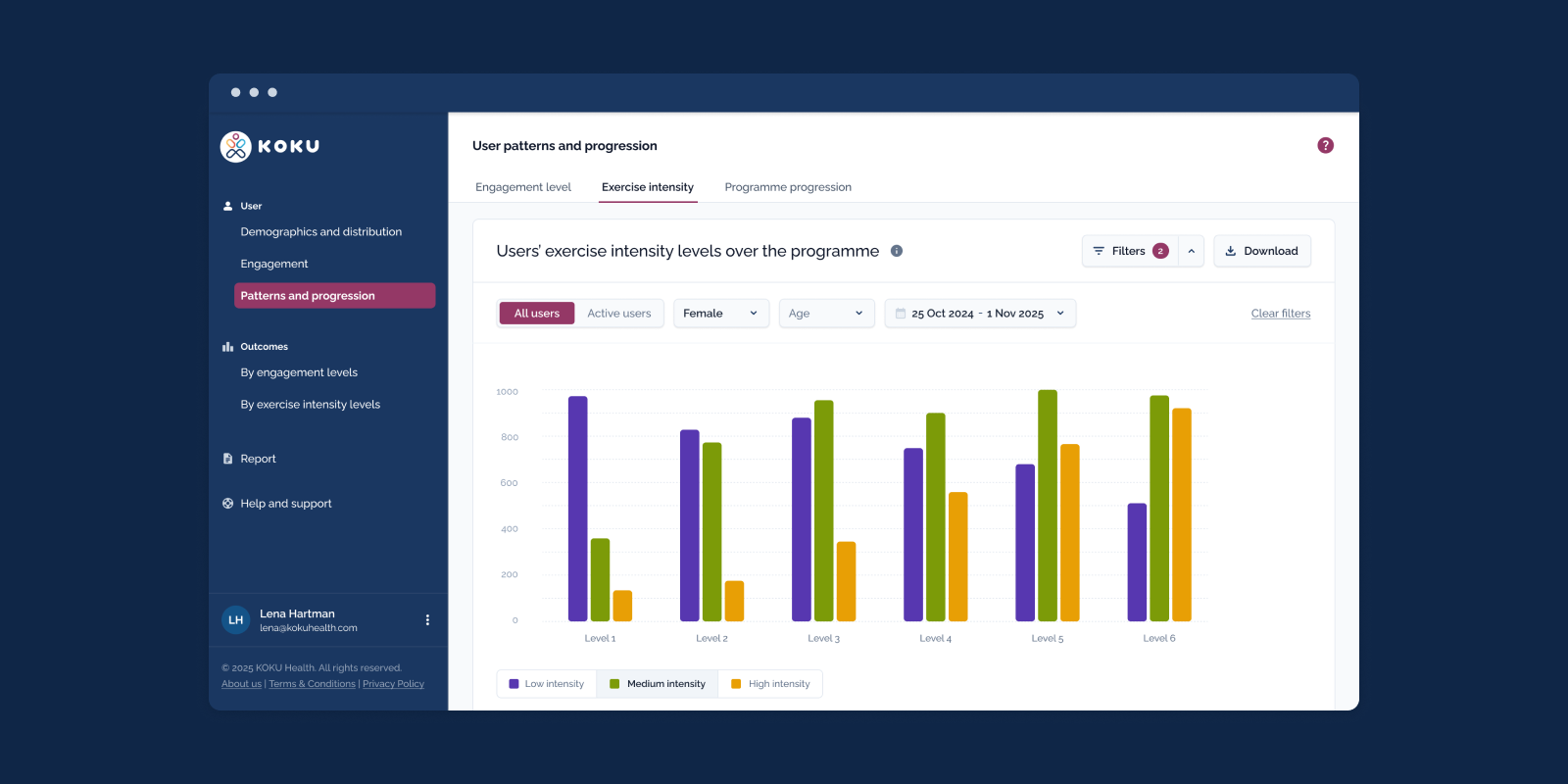
KOKU dashboard UI design
What we did
Discovery and scoping · User research · MoSCoW prioritisation · Information architecture · UX design · Dashboard interface design · Data visualisation · Frontend development (React/Next.js) · Python API development · Docker-ready deployment · Reporting and export functionality