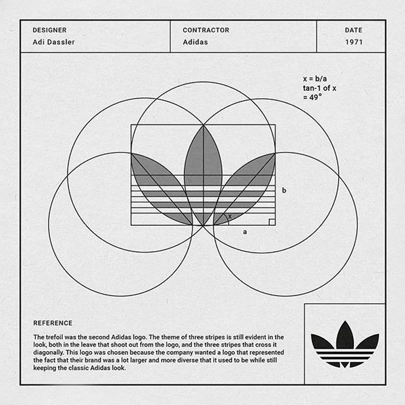
Corporation Pop’s roots are in design. Our MD and our Chair both started their careers in the discipline and it continues to influence our work heavily. That’s why this throwback to the design origins of the iconic adidas trefoil logo caught our eye.
Logo
adidas designed the logo in 1971 and it first appeared the following year. The trefoil design was a collab between adidas head honchos and a German creative agency, and it represented the company’s first foray into clothing.
Its inspiration was drawn from florals and manifested in three elegantly designed leaf-shaped foils. This was not an arbitrary choice but a deliberate nod to adidas’s classic three stripes, ensuring continuity and brand recognition.
The trefoil also seamlessly integrated the enduring 3-Stripes motif, weaving through the leaves as a testament to adidas’s visual identity.
adidas originals
In 2020, adidas commissioned Corporation Pop to design the packaging for a pair of adidas Originals. They’d teamed up with footwear retailer, size?, and our long-standing client Cream, to produce a special edition of the trainers. Size? were celebrating their 20th anniversary, Cream were supplying the DJs for theparty, and they invited us along for the ride!
This is an interview with Corporation Pop’s Managing Director, Dan Taylor, who headed up the design. In it he talks about combining visual elements from Cream’s back catalogue with adidas’s brand and logos — including the trefoil.
If you’ve not seen them before, I’m sure you’ll agree, they’re pretty Spezial. And for the record, Dan still hasn’t worn his Cream edition trainers.
