Corporation Pop has been making companies look good for more than thirty years and since 2012 one of our specialities has been the healthcare sector.
Our roster of health tech and digital health products includes patient apps, trainee websites, mental health support for staff, clinician tools, administrator portals, work with robotics, and a digital healthcare platform for paediatric patients which is particularly close to our hearts.
Patient Apps
Careloop
As the digital health arena continues to grow, Corporation Pop has been involved in products designed to be used directly by patients. Careloop is an app which assesses new parents’ wellbeing and identifies signs of postnatal depression.
Careloop Health’s existing app wasn’t meeting the demands of the people using it, so they came to Corporation Pop for a redesign after learning about our expertise in digital user experience.
We quickly unearthed the problems: it was outdated, inaccessible, lacking structure and hierarchy, and not very user friendly. It also needed an update to fit with their new brand.
We presented Careloop Health with a design better suited to users’ wants, needs and lifestyles. It was more broadly usable because of its improved accessibility, and far more engaging than its clunky predecessor.
Working alongside an animation agency, we delivered a set of interactive wireframes accompanied by a full set of assets, updated brand guidelines and a visual design so their team could rebuild the app.

Xploro
Xploro was born of personal experience when Corporation Pop’s Chair, Dom Raban, witnessed his daughter’s struggle for age-appropriate information when she received a cancer diagnosis as a young teenager. An in-house project which is now a multi-million dollar company of its own, Xploro is being used by paediatric patients in some of the biggest children’s hospitals in the UK, USA, Europe and Africa.
The child-friendly app offers kids interactive and engaging educational content to help them understand and cope with a difficult period of their lives as they undergo treatment for a serious illness.
Xploro includes games, hospital rooms, members of staff, story books which explain procedures such as having a blood test, an MRI scan or sedation, a calendar and a chatbot the child can ask questions about their experience to.
There’s an online platform for parents so they maintain control over their child’s experience. And there’s also a clinicians portal so the child’s healthcare team can collect self reported outcomes and share information with their patients.
Children who used Xploro demonstrated a statistically significant reduction in anxiety and statistically significant increases in patient satisfaction and knowledge about procedures, compared to children who received the standard information provision in a study conducted at the UK’s largest children’s hospital.
ASARM
The Chronic Fatigue Clinic at Royal Manchester Children’s Hospital traditionally asked patients to keep daily paper diaries of their sleep, rest and activity levels. Clinicians then analysed and used this data to make recommendations.
As you can imagine, paper diaries can be unreliable and pose problems with the security of patients’ data. That’s why the clinic asked Corporation Pop to design and build an end-to-end solution in the form of a patient app and a clinician’s portal.
ASARM packs a punch on a fairly conservative budget. It’s a simple, safe and secure app which improves the collection of information and delivery of prescriptions. It makes the work of the clinic more efficient and more accurate, saving hours of time all round.
Coupled with the portal, the app is a powerful tool. It offers clinicians a range of reports, which improve insights into their patients’ habits.

Websites
We’re proud to say we still work closely with our first healthcare sector customer, Manchester University NHS Foundation Trust (MFT). They’re one of the largest acute trusts in the NHS, employing over 28,000 people. We’ve designed, built and managed websites for their Research and Innovation department, Biomedical Research Centre, and Surgical Skills Simulation Centre.
They are fairly straightforward brochure sites which do the job well and look great within NHS brand guidelines. That coupled with our reliable, fast and friendly customer service, is why MFT continues to choose us to maintain them.

Staff recognition and welfare
LCEA Portal
In 2019, MFT commissioned Corporation Pop to design and deliver an online portal for their Local Clinical Excellence Awards. The awards recognise the work of clinicians and reward them with bonuses on top of their salary.
The problem MFT asked us to solve was the immense scale of the paper-based awards programme they were using. The programme drained resources in respect of the time spent to administer it and the enormous amount of paper involved. MFT wanted consultants to apply online, at their convenience, and for verifiers and assessors to access and evaluate applications securely. Additionally, they required full visibility of the awards pipeline for admins, to prevent bottlenecks and facility a smooth process.
The LCEA portal which did all those things. It made the process more efficient, reduced the drain on resources and improved security immeasurably.
Since then, Corporation Pop has transformed the standalone LCEA portal into an online portal. Any NHS trust, regardless of size, can commission and customise it, and it’s quick and easy to implement.
MindYourself
The impact on health and social care staff’s mental health during the Covid pandemic was the trigger for MindYourself. Dr Jan Smith, Research Associate at Sheffield Hallam University, asked Corporation Pop to design an app. She wanted a resource staff could tap into, whenever they chose, to prevent a decline in their mental health. She wanted users to be able to identify telltale signs of stress, burnout and depression in themselves and others. Importantly, she wanted staff to know they weren’t alone, they could get help, and there was hope.
Following human-centred design principles, and tapping into our UX expertise, we researched and defined the problems, and worked with Dr Smith to come up with a raft of potential features. We identified four pillars: challenges, situations, tools and support, and used these to base our design on.
The Corporation Pop team delivered a working prototype called MindYourself specifically tailored to healthcare workers.
With exemplary UX and UI at its heart the prototype was easily accessible, simple to navigate and cheerful. Put simply, it made the delivery of support effortless.
Education
M-Care
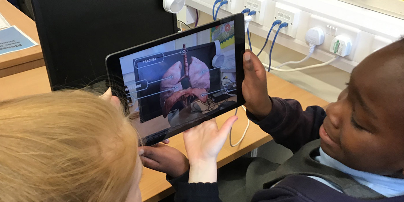
Health Education England and Manchester Metropolitan University commissioned Corporation Pop to design and develop a suite of resources for schoolchildren. They included VR, AR, educational games and 3D body system fly-through videos and we called it M-Care.
The goal was to teach children vital information included in the national curriculum. Additionally, it encouraged them to appreciate and consider a future career in the health and care sector.
The product was co-designed with the youngsters it was made for, and we used the power of storytelling to capture their attention and engage them from the outset.
We presented three real-life healthcare scenarios. For each we built games, created virtual reality experiences, and designed augmented reality assets to describe human organs. We described a variety of careers and job functions to users by introducing healthcare staff characters throughout the experiences.
By using a combination of outstanding UX research, game devising, 3D artistry, scriptwriting, design, VR building and Agile project management, we really pulled it out of the bag. We created state-of-the-art educational tools that met the demands of the national curriculum and the children that used them.
Hardware
Gable
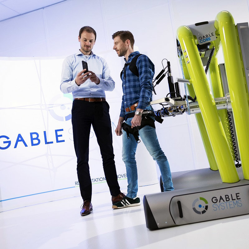
Dutch company Gable Systems had developed a robotic exoskeleton to help people who are learning to walk again. Patients might have a condition like cerebral palsy, a medical emergency such as a stroke, or a spinal injury.
The exoskeleton was extraordinary, and the next step was to commission an app to control it.
Corporation Pop built an easy to operate Android app which integrated perfectly with the kit. Its sleek, intuitive design simplified the use of the exoskeleton for use by patients and physiotherapists.
Wearables
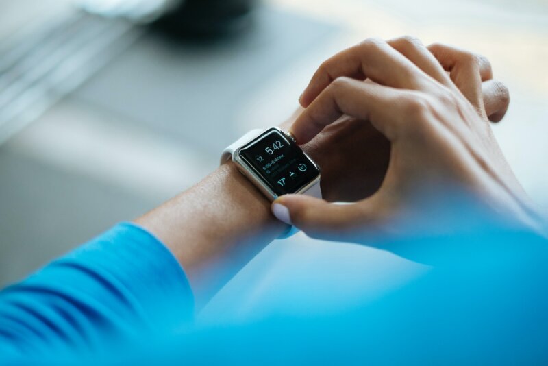
Corporation Pop is well versed in the UX and design of wearable devices such as smartwatches and fitness trackers. We have a thorough understanding of the limitations around real estate, UI, accessibility and context and the skills to match.
The technology is still in its early stages, and the potential for growth is huge. As you’d expect, Corporation Pop is all over it and can guide you through the process with ease.
Corporation Pop’s experience with health and social care products has given us a deep understanding of the sector. We recognise the importance of data security, and the required focus on patients, clinicians and administrators.
If you’re looking for your next health tech partner, get in touch for a chat. Corporation Pop could be exactly who you are looking for.
Get in touch