Small tweaks, big difference. See how best practice UI choices take common components from ‘just fine’ to genuinely useful.
Design choices shape how people experience your product. The difference between something that works and something people actually enjoy using often comes down to small, smart decisions.
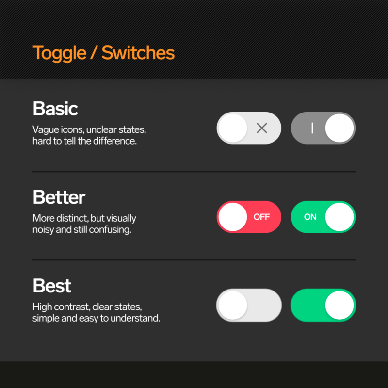
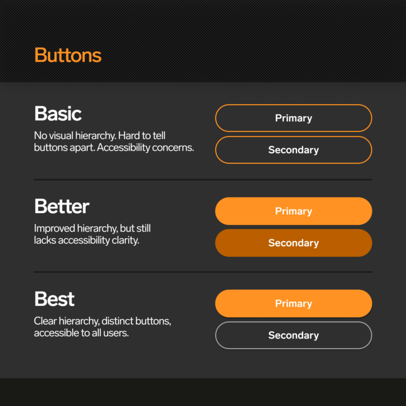
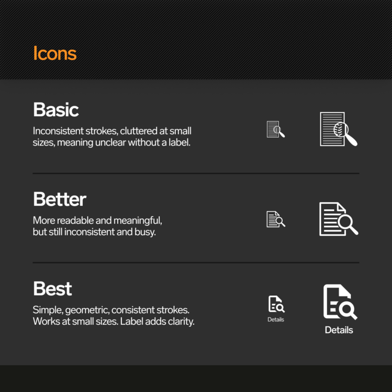
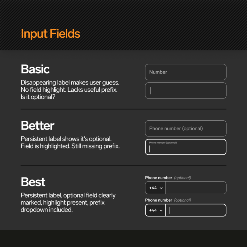
This article explores eight common interface elements, such as toggles, buttons and input fields, and shows how each one improves through mastering UI.
We’ve broken it into Basic, Better and Best to highlight how clear, consistent design can reduce friction, improve accessibility and make products feel easier to use.
These are not big overhauls. Just simple changes that make a noticeable difference.
Scroll through the images below to see how best practice UI looks in action.
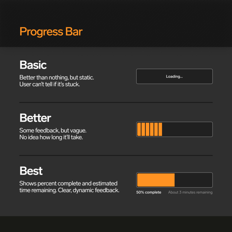
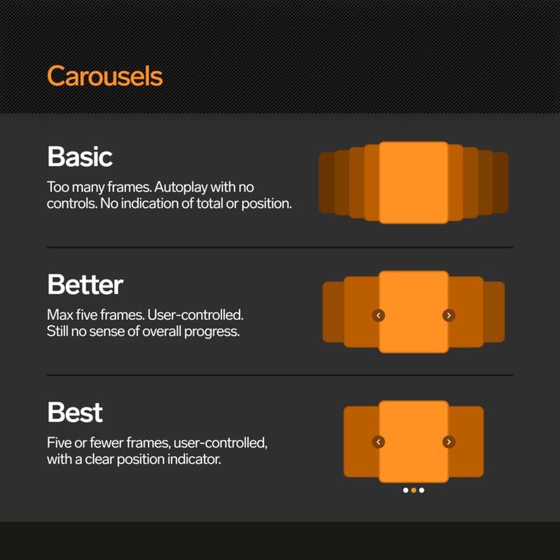
Good UI isn’t about adding more. It’s about making better decisions with what’s already there. When you apply best practice UI principles, you reduce friction, guide users more effectively, and help people complete tasks without second guessing themselves. These improvements often seem small on their own — replacing an icon, tweaking a label, adjusting contrast — but together they shape how users feel about your product.
Too many digital products settle for “good enough”. But good enough is forgettable. If you want to stand out, the interface has to make sense, feel smooth, and get out of the way.
Good UI doesn’t guess. We test, refine and build with users in mind.
If your current UI is starting to feel clunky, inconsistent or just a bit tired, we can help.
Message us to find out how