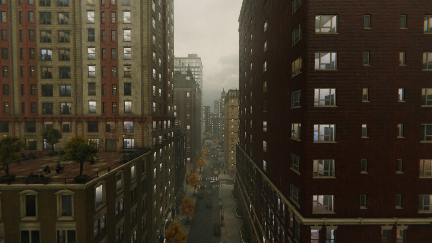
Large open world games, with sprawling urban environments, require special consideration for optimisation. One such optimisation we’ve been trialling is creating fake interiors.
The problem when creating large-scale buildings or cities is that it’s too time consuming to individually model the inside of each room in every building. Even today’s consoles and PCs struggle with that much geometry being streamed as players move through levels. And you can forget about a mobile VR headset with its limited processing power.
The alternative
Physically modelled interiors would blow our budgets, so we looked at a different technique called parallax textures. This offered an opportunity to create interiors which were baked to a texture and unconstrained by polycounts or material complexity. As rendering these is less costly than creating geometry, we could have more interiors in our experience.
There are various ways to go about this; this is how we did it.
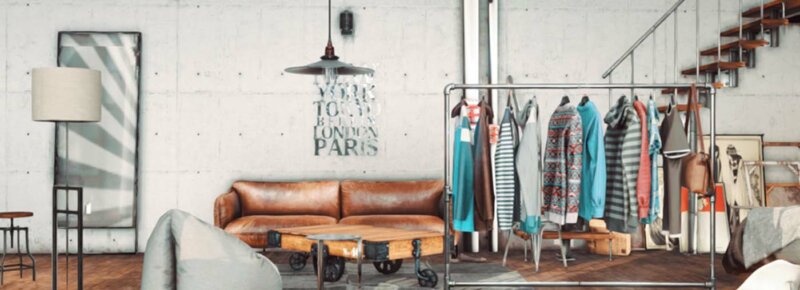
The method we chose was to take a flat texture, duplicate it several times, and apply a number of masks. With different layers constructed with masks, we created a parallax effect so, as the camera moves, the different layers distort.
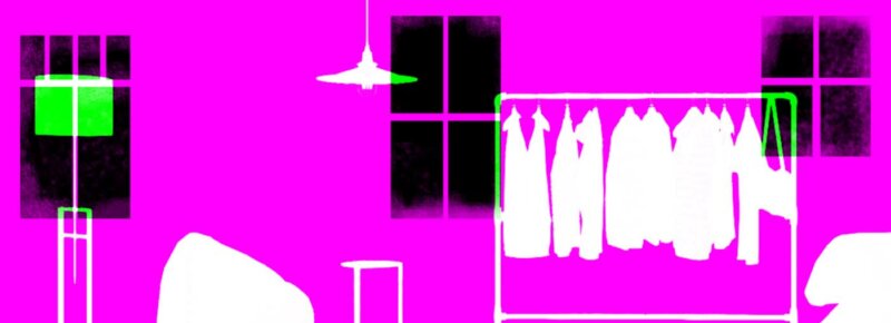
For further optimisation, we packed the separate masks into different colour channels on the RGB of the image.
Construction
Once the images were in, we could construct our buildings.
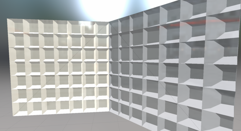
This method uses what are called cube maps, which are textures that represent a three-dimensional rendering of an area. We then directed which part of the cube map users saw using the camera’s looking direction and a parallax effect.
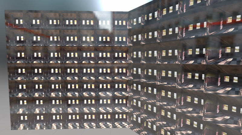
We were then able to tile the cube map and have lots of rooms being rendered, whilst only using two triangles per wall.
The parallax effect became more evident when the image moved.
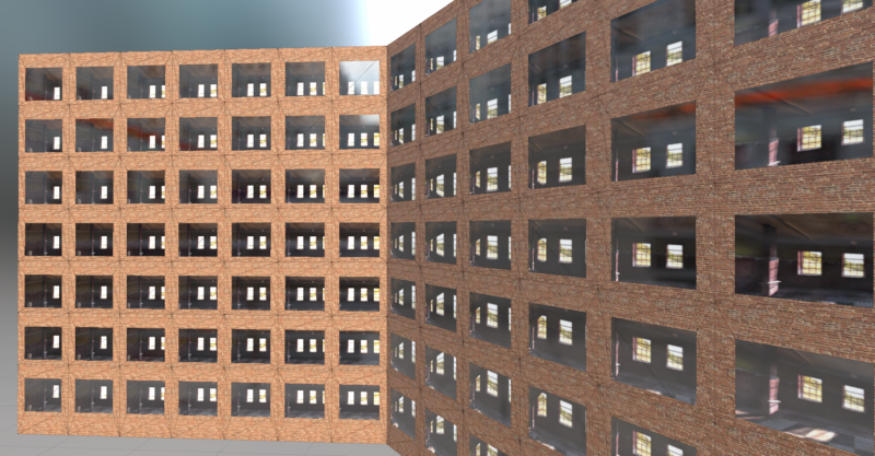
With a suitable cube map applied, our shader then distorted it depending on the camera angle, creating lots of small walled rooms. All that was needed afterwards was the exterior of the building and windows.
The outside of the building is quite basic in this example because this is all just a test, however…
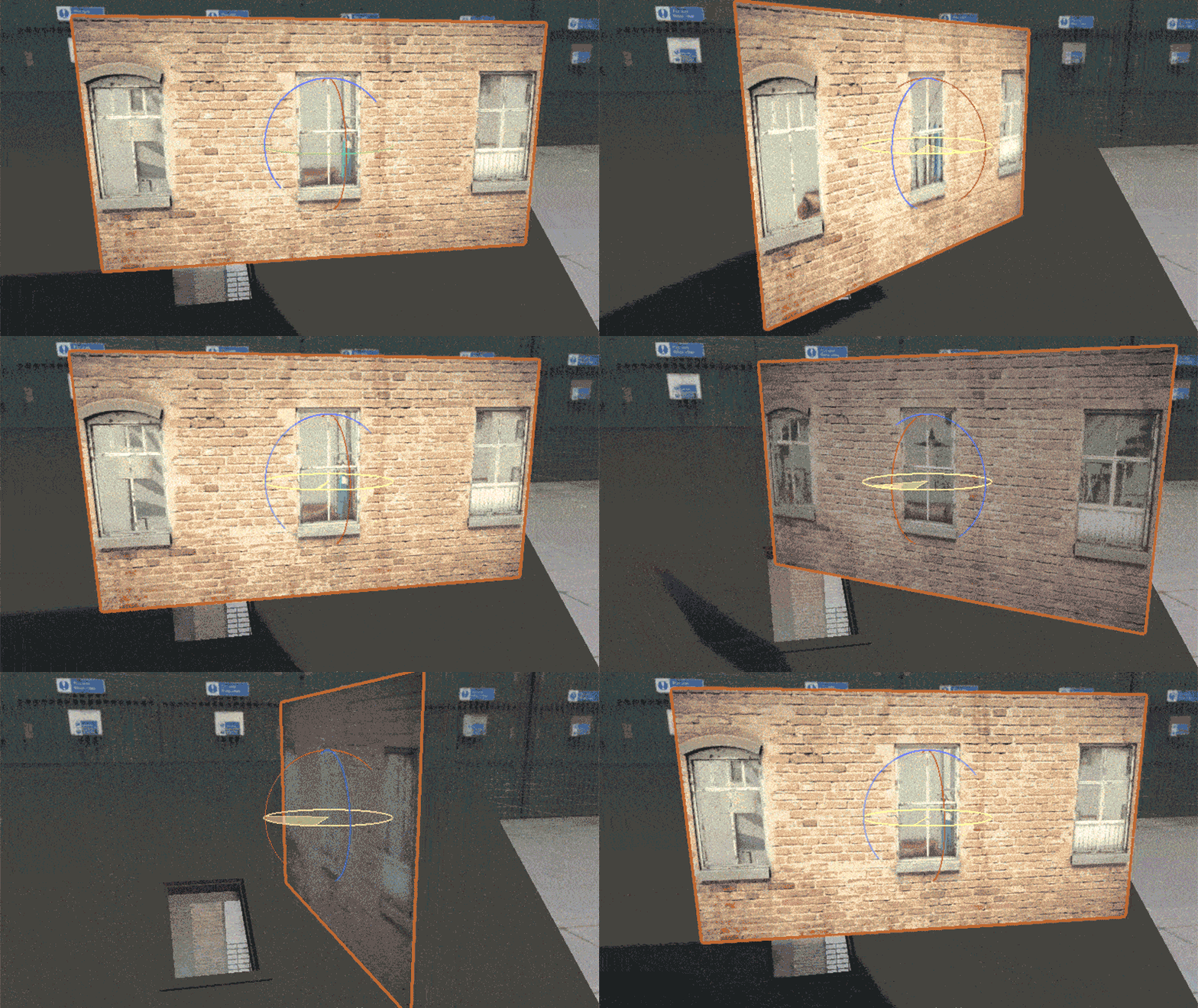
The magic window
The finished result was much more obvious with motion. You can see the cube map changing as the camera view to the object changes.
This method is slightly more expensive to render, however, it allows for much higher quality fake interiors that we can also randomise to create more variation.
