‘What I’m after,’ said Saskia, ‘is a T-Rex with lasers for eyes, that eats bugs. Do you get me?’
‘Leave it with me,’ said Dan. ‘We’re all over it.’
And that was where REX’s branding journey began, with a wild idea from Saskia Coplans, our DPO, and founder of REX and its parent company Digital Interruption.
REX is a vulnerability scanner designed specifically for software testers and developers to help assess the security of Android applications. It scans the apps as they’re being developed to detect security weaknesses early and often.
REX made its first appearance on the Digital Interruption website. However, in their own words, the page didn’t fit the product and it was a bit ‘crappy’. They needed a better way to reach potential users and realising the sad page, abandoned at the back of their website, wouldn’t cut the mustard they turned to us.
A brand is born
Corporation Pop’s MD, Dan, is also our Creative Director, and he loves to get hands-on every once in a while especially when it comes to branding. So, he grabbed the reins of the REX logo project and, after an initial scoping meeting, came back with a retro pixelated dinosaur concept.
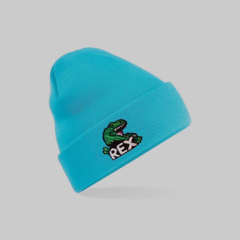
The name, REX, sat front and centre of the logo with the (now iconic) dinosaur posing above it. It was flat and mono but was unmistakably the start of what we see here. Within a few days, the T-Rex had arms, contours, and the glimmer of a character, but he was dark red.
Tell me what you want
As with anything Corporation Pop does, the back and forth between us and our client is essential, and we thrive off feedback during a project.
Initial reactions were promising and read like this:
- The shading looks amazing
- We love his diddy hands
- We’re not mad about the red — can we try green?
- Can he have a little pink tongue?
Well, why not? So, Dan got back to work on another round of tweaks.
As you can see above, REX was now green and, as requested, he had a little pink tongue. So, Dan shared the next iteration and waited for a reply. He didn’t have to wait long.
What you really really want
This is what Saskia replied — verbatim:
Dear Dan (clears throat and puts on professional voice)
Harriet and I have reviewed the logomark and have the following feedback:
Saskia: HAVE YOU SEEN THIS YET???
Chipie: OMG! YES TO THE GREEN! OH I LOVE IT!
Saskia: AND THE LITTLE DIDDY TONGUE!!! I literally have no feedback other than HE’S PERFECT!!!
Chipie: It’s so good. I’m loving that green. What’s happened to the top of the E? Did he bite some of it off? chomp chomp!
Saskia: I feel like he’s hungry. HOLD ON TO YOUR E’s, REX IS COMIN FOR THEM! It looks like he’s posing for a cheesy selfie — which I also love!
TL;DR: It’s perfect, we absolutely love it, we wouldn’t change a thing and if the bit missing in the E is an error please can we keep it?
Not bad, eh?
Logo roll out
So, with the logo in the bag, Dan created a toolkit containing the key brand assets which Saskia’s internal marketing team then rolled out across the website.
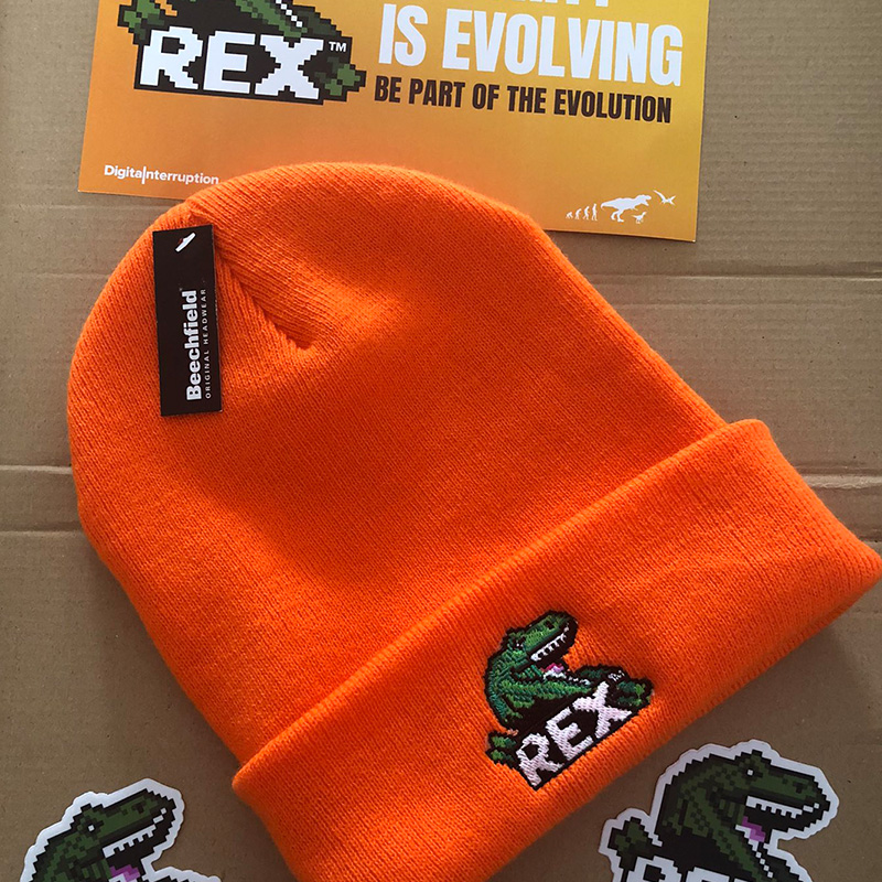
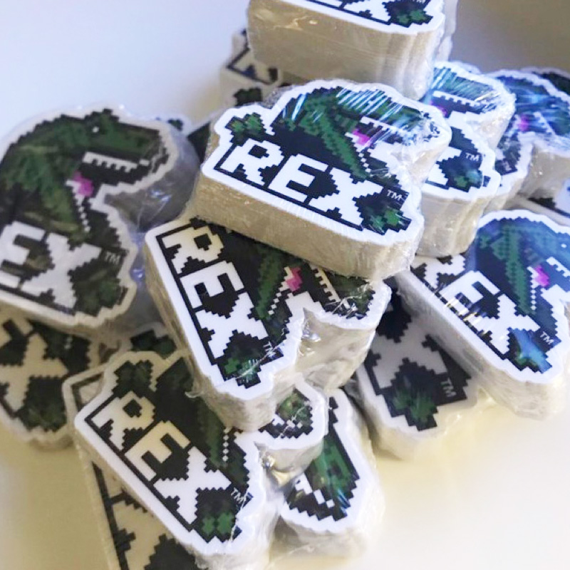
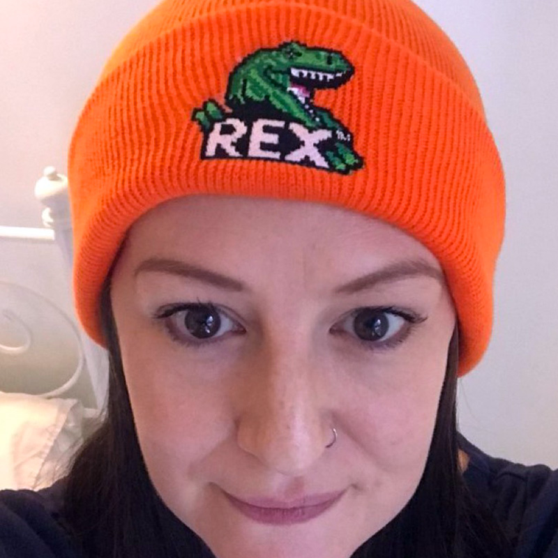
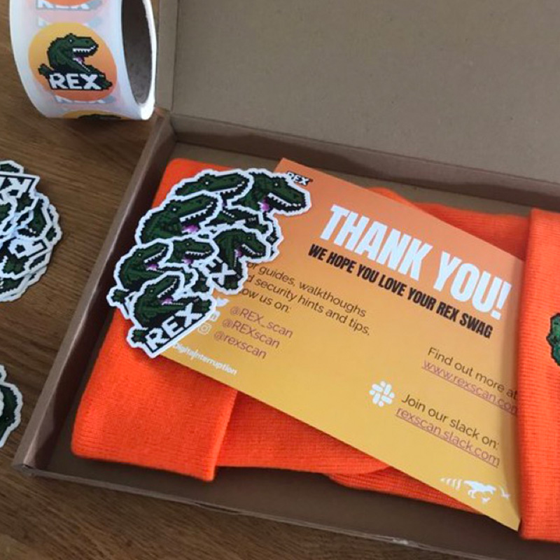
The guys at Digital Interruption were so enamoured with REX, with his diddy arms and his little pink tongue, that they took it a step further and he can now be found on beanies, badges and stickers which they gift to new clients. But, more importantly, the logo has helped them create a brand and communicate their tone of voice to potential customers through the medium of dinosaurs. In turn, this has helped them build a successful company with services people want to buy.

You can read what Saskia had to say about the process here but to give you a feel for it, when we asked her for a quote, this is what she said:
“Find designers who you click with; communication is key. Corporation Pop are the cool kids everyone wants to hang out with so we knew they’d be perfect for REX. They also love orange as much as we do. More seriously they are a design house that also make apps. They understood our audience because they are our audience.”
Saskia Coplans
Founder – REX