I grabbed a coffee with Corporation Pop’s Design Lead, Martin, because I wanted to learn more about website accessibility and why he invests so much time in it. As the least technically minded person in the studio, I asked him to talk to me like I was a dummy — thankfully he played nice. This is how it went:
The importance of accessibility
For anyone that’s not familiar with the idea of online accessibility, would you tell us what you mean by it?
At its simplest, accessibility is about inclusive design. It’s about designing for everybody, regardless of who they are or what their needs might be. It’s about making sure that anyone visiting your website can understand it and access it easily.
And why is that so important?
Because you don’t know who’s going to be visiting the website. A user might have physical, visual or cognitive impairments and we want them to get the same experience from it as everyone else. Inclusion and equality are important.
Is there a legal requirement for accessible websites?
There is in the United States but here it’s only public bodies that have to offer it. Of course private sector businesses fall under the remit of the Equality Act 2010 which states that UK goods and service providers cannot discriminate against people with a disability. But, when it comes to websites, it’s quite loose and not tied to specific requirements. Because of that it’s more subjective and harder to enforce.
But why wouldn’t you want to make your site available to as many people as possible? It makes good business sense, and it’s the right thing to do. It’s best practice, and that’s what we’re about at Corporation Pop.

Back to basics
So talk me through your first considerations when you come to design a website.
There are two parts to designing accessibility into a site: visual and technical. But we don’t treat them separately, they work hand in hand.
What are the main things from a visual point of view?
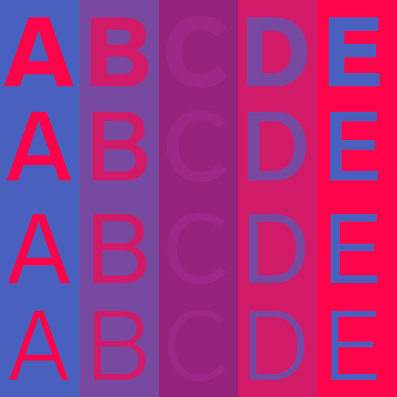
One of the first things I consider is the font we’re going to use. At a very basic level, it needs to be legible and big enough so it’s easy to read.
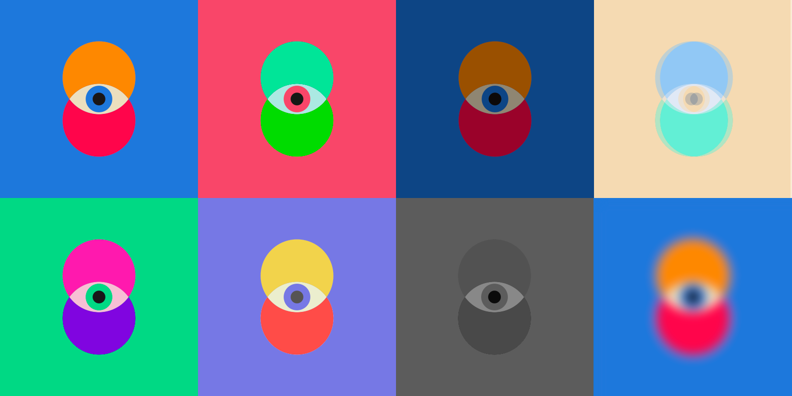
Then I think about the colour palette; is the contrast ratio good enough so someone with a visual impairment can still read it comfortably?
Sometimes, your client or their brand guidelines take accessibility decisions out of your hands. For example: the use of certain typefaces, an instruction that text must all be in caps, or a requirement to work with a set colour palette. Interpreting them and producing something both accessible and visually elegant is the problem we solve as designers.
There’s software to pass designs and code through to ensure you’re meeting these requirements but you can also use the squint test as you go. It’s very unscientific but as a quick litmus test you’ll pick up issues almost immediately.
Of course, for some people, their visual impairment is such that they’re blind in which case they might use a screen reader. In that case we move away from the visual and towards technical considerations.
Like what?
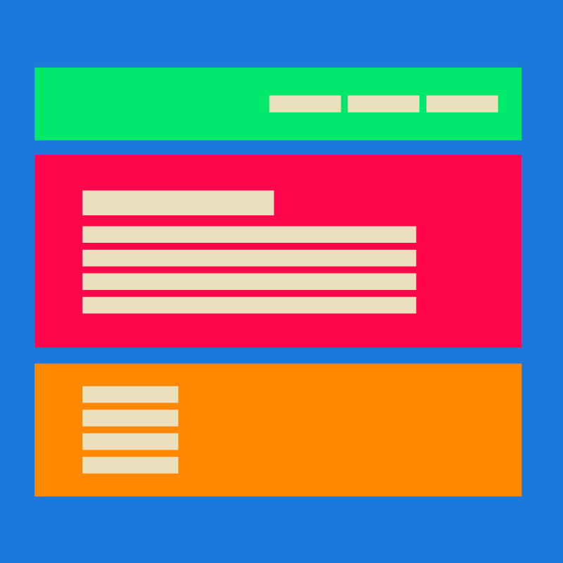
Document structure is really important, so the core HTML semantics needs to be bang on. Screen readers rely on this to describe what things are so, when you use the wrong tags, they’re relayed incorrectly to the user. Google also reads your markup, so it’s fundamental for SEO.
HTML markup has developed and there are lots of approaches like adding WAI-ARIA Roles if needed. But that’s a story for another time. Usually the best approach is to keep things as simple as possible and make sure everything’s announced correctly by wrapping content in the most appropriate tags.
So, if you’ve got a menu with links to other sections of a site — wrap it in a <nav> tag. Need a consistent footer on all pages? Wrap it in a <footer> tag. And the main content of your webpage? You guessed it, wrap that with <main>.
These HTML5 tags all have landmarks and roles baked in and screen readers know exactly what everything is so long as you use them correctly and in the right order.
There’s much more I can ramble on about with document structure but I’ll leave you with this thought: every time a developer uses an <a> tag or <div> instead of a <button> to fire some event on a page, a kitten dies. We all like kittens, so don’t.
So you see, it’s really important to build a website with semantics in mind — not just for kittens but for SEO and with screen readers in mind.


Accessible content
I imagine there’s only so much you can do when you design and build a website. At some point, the client is going to take over.
Yep, especially if they’re using a CMS. Content is equally important as the design when it comes to accessibility. If the owner of the website uses headings inconsistently, or in a way which they think looks good rather than as they should be structured, then screen readers are going to report it as nonsensical. So, what I try to do is educate clients in the best ways to structure their content. Getting it right is important for accessibility but also, because of the way search engines work, it’s just as important for SEO.
Right, so if I’m writing for a website and I want it to be more accessible what would you suggest.
Copywriting is important. For best practice you can have a look at the Plain English website, there are lots of resources there. However, there are lots of online checkers which will tell you how easy it is to read what you’ve written. The Flesch reading ease score will look at things like sentence length, and the number of syllables in words. You’re then given a score from 1 to 100 with 1 being fairly tricky to read and 100 being easy.
And don’t forget how you add that content – don’t use a <h3> then a <h2> then a <h6> you might find the styles assigned to those make the content look more attractive, but again google and screen readers won’t make head nor tail of the semantics. This structure is just as important to avoid kittens dying.

Accessibility in practice
Okay, so I reckon I’m getting to grips with the concept and the things you need to consider. Now can you show me an example of a website with great accessibility?
It just so happens that I’ve been working on one recently.
Who’d have thought it?
I know! This is my ‘here’s one I made earlier’ moment. Corporation Pop was recently commissioned to design and build a website for the Green Space Dark Skies project, part of Unboxed: Creativity in the UK. GSDS, as we call it, is a series of outdoor, participatory arts events at sites across England, Northern Ireland, Scotland and Wales. It was a big deal because the events attracted tens of thousands of people from all backgrounds around the country.
So it needed to be accessible to as many people as possible?
Exactly. So you’ll see here the things I mentioned before — font sizes and colour contrasts and so on — and in the background we’ve structured everything properly. But besides that there are a bunch of other things.
Such as?
For starters, on the homepage, you’ll see a pause button. That literally pauses the video animation on that top section. And you see the ticker tape underneath it? Well, you can switch that off too. Down in the footer is a toggle button to reduce animations across the whole site (which automatically applies if the user has opted for reduced motion preferences). Those things can be beneficial to some people with visual impairments as well as some with cognitive challenges.
The website uses lots of video content and you’ll see that they all have versions with closed captions as they become available, the content managers are adding audio descriptions too. We also included enhanced interactive elements for easier keyboard control to make the site more accessible to those with certain physical disabilities.
Inclusive design highlights from the GSDS website showcasing keyboard only navigation of the site and interactive components.
Website accessibility standards
How do you know what you’ve done is good enough?
There are industry standards, for example WCAG, which we work towards, the holy grail being a AAA standard. However that’s not practical for media-rich websites and we can rarely achieve it for that reason. Instead, what we work towards is an AA standard.
That being said, nothing beats testing. With the Green Space Dark Skies website, we engaged a third party team with a range of impairments and disabilities to test the site and ensure it met their needs. It’s all about people at the end of the day, isn’t it? And so, with that in mind, we also provide ongoing support and best practice advice to the CMS editors managing the website.
“Why wouldn’t you want to make your site available to as many people as possible?
It makes good business sense, and it’s the right thing to do.”
Need support making your website more accessible? Whether it’s a brand new build or updates to an existing one, we can help. Drop us a line to find out how we make inclusive design feel straightforward and genuinely useful for everyone who visits your site.
Get in touch
