Careloop Health already had an app. Using the Edinburgh Postnatal Depression Scale (EPDS), it was meant to assess new parents’ wellbeing and identify signs of postnatal depression. Early intervention, after all, prevents escalation and promotes faster recovery.
Unfortunately it wasn’t meeting the demands of its users so Careloop Health called on Corporation Pop for a redesign.
Research
UX research was key to understanding why the app was failing, and so we began a thorough market interrogation and competitor analysis. We also conducted workshops and focus groups with parents who already used the app, the findings of which proved invaluable.
Research revealed the existing product to be outdated, not accessible, lacking in structure and hierarchy, and not very user friendly. It also needed an update to fit with new brand guidelines.
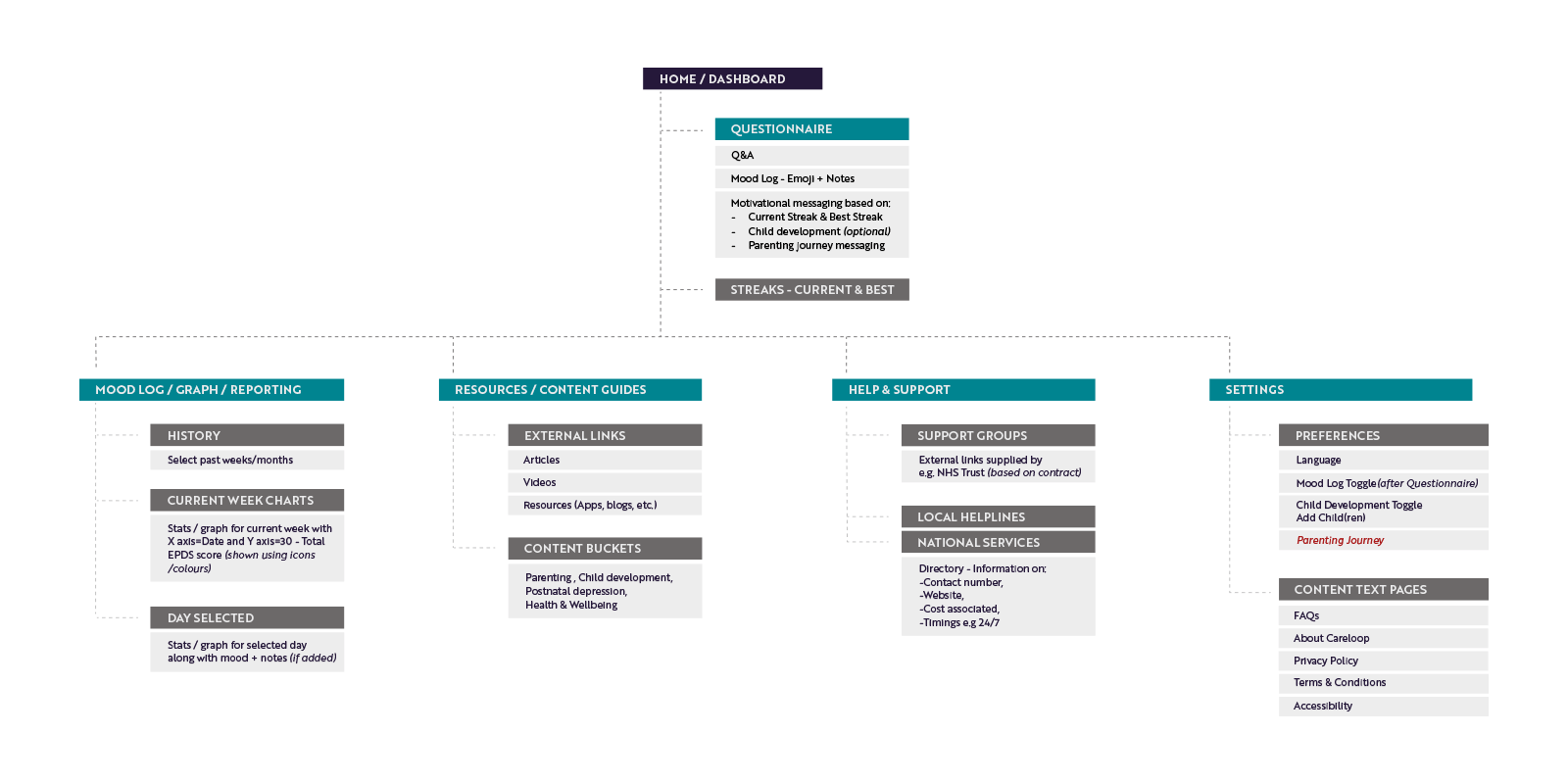
App roadmap
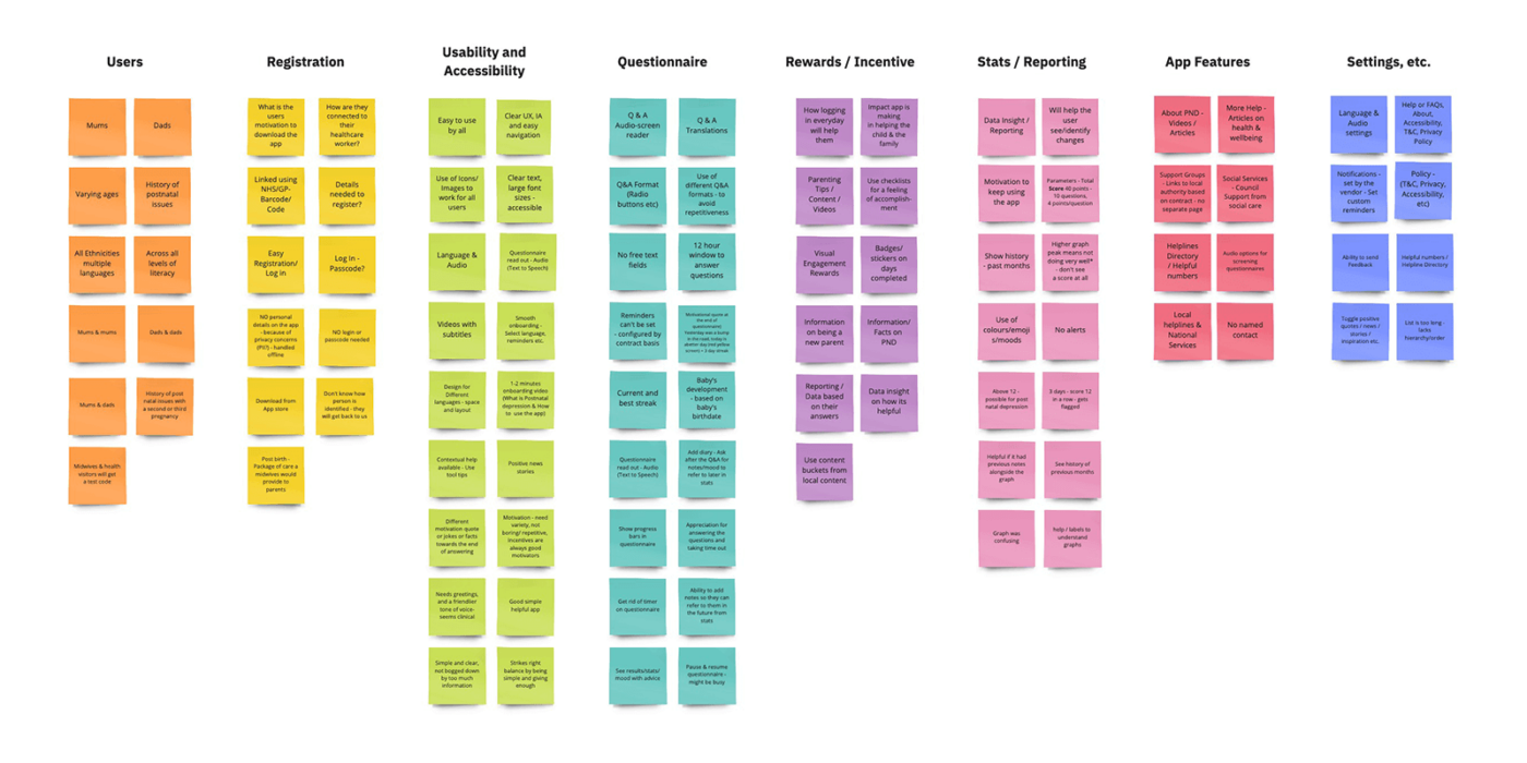
We proposed a product roadmap to Careloop Health identifying key features based on our findings. We prioritised the features and agreed on a list of deliverables before moving on to a site map, user flows, user narrative, and finally content planning. Even at this early stage we encouraged Careloop Health to compile content for their spruced up app. These things take time so early focus was important.
Accessing Careloop
From the outset, it was important to encourage those with lower literacy levels to use the app and to make it more accessible. Parts of the app were difficult to read, often causing frustration and making users anxious. The visual language of the app, therefore, had to be simplified and made intuitive.
With the findings from our research, and our set of challenges set out in front of us, we got to work designing Careloop Health’s new app.
Challenge: Low literacy levels, health inequalities, and different languages
It is widely accepted that people only take control of their health if they understand their condition and available treatments. However, readability data suggest the average reading age of the UK population is 9 years old. We wanted to address the health inequalities that come from low literacy levels by using innovative multimedia content. This would bring our screening tools to more people and enhance the experience for all users.
Additionally, for 4.2million people in the UK, English is their second language. Improving the format and accessibility of our content would help those people. We also wanted to look at translating content to further increase accessibility.
Response
We implemented two solutions to make our app more user-friendly:
- Language selection during onboarding: We added the ability for users to choose their preferred language during the onboarding process. This simple but effective feature opened up the app to a wider audience.
- Multimedia content with subtitles: We incorporated animated videos into the onboarding process to make it more engaging and easier to understand. These videos also included subtitles in the user’s chosen language, providing additional support for comprehension.
We then introduced non-text based formats to assist parents, such as text-to-speech functionality that reads out the questionnaire to them. These measures helped enhance the accessibility of our app for all users.
Challenge: engagement
The old app was neither engaging nor stimulating. If you can’t grab a user’s attention you’re on a hiding to nothing. Feedback from parents during the research sessions informed us they found the app flat and unhelpful. We needed to address that.
Response: interactivity and resources
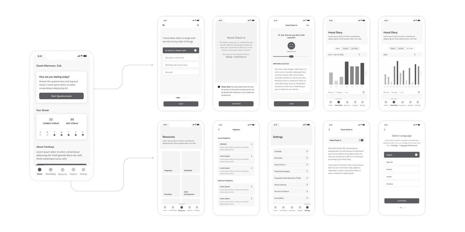
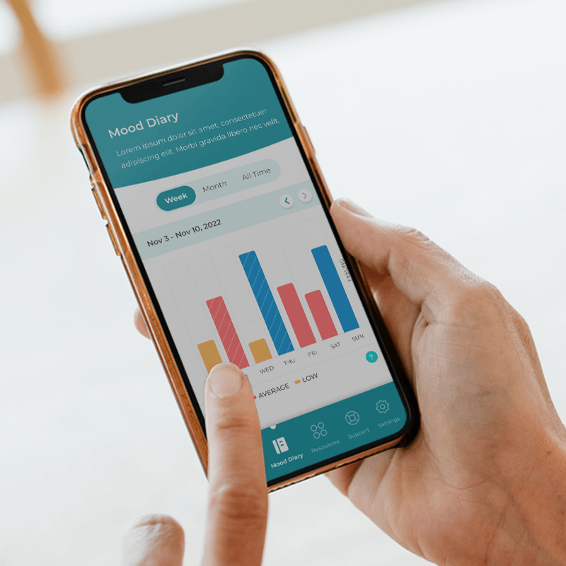
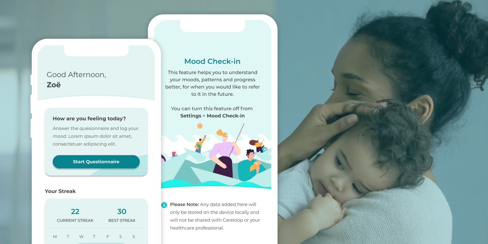
Involving users in their healthcare journey was crucial to engaging them. We included the option to add moods and notes each day after finishing the questionnaire. A sliding scale using emojis allowed parents to record how they felt that day and to review their progress. Parents could now compare their mood month on month and understand anomalies by reading the associated notes. We presented moods as easy-to-understand graphs in the app.
We identified, from the research, that adding a ‘current’ and ‘best’ streak for days parents answered the questionnaire could be motivational so we included it.
Parents were often looking for support or resources so we included them in the app. We presented resources as content buckets including subjects like pregnancy, childbirth, child development, parenting, postnatal depression, and health and wellbeing. Parents could access articles, and links to external websites and resources which might be beneficial to them.
The app offered support as links which directed parents to local and national services or helplines. The links were directly clickable in the app and came with info on timings, associated costs, and helpful phone numbers.
Challenge: straightforward onboarding and setup
In the old app, onboarding was tricky, and setup complicated. This proved a barrier to users right at the beginning of their journey when they should just be getting going.
Response: simplicity and streamlining
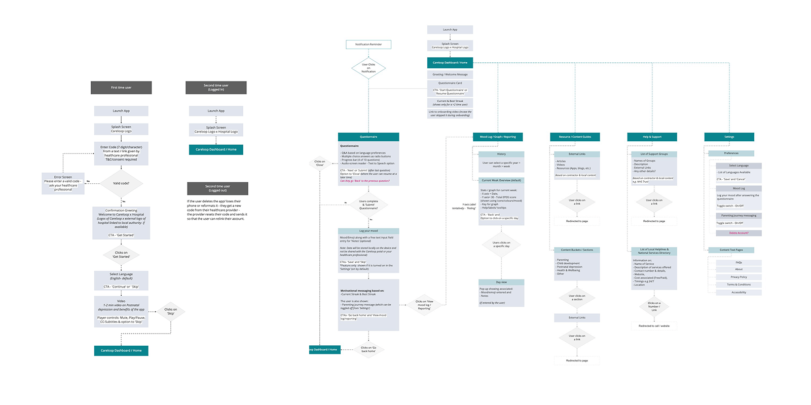
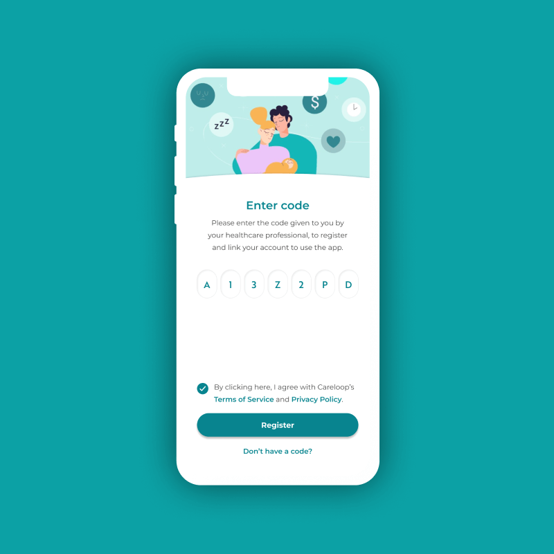
To streamline the process, and identify users their healthcare providers gave them validation codes. We also provided help to any users that weren’t sure how to get a code.
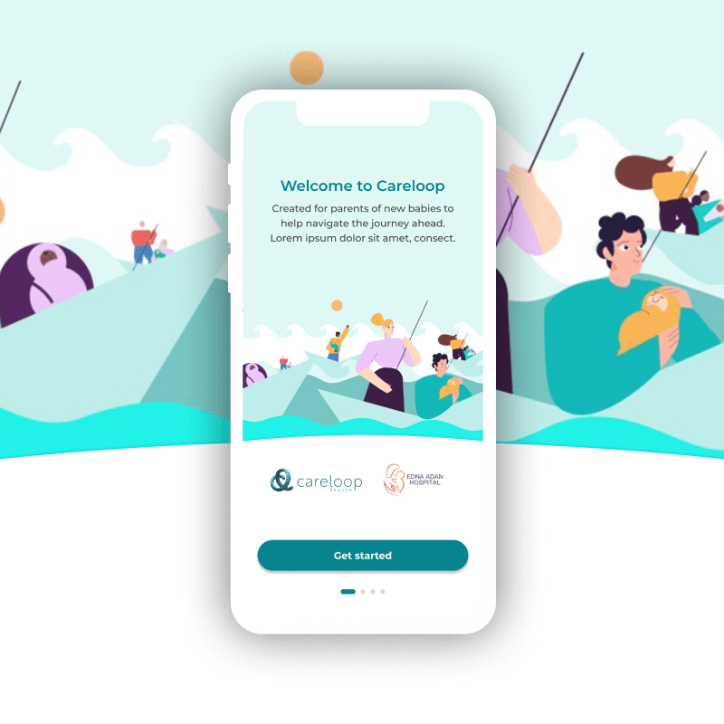
We designed a simple onboarding flow which was broken into easy to follow, understandable, bite-sized chunks. Early in the process we included the option to toggle notifications and reminders on and off giving users more control.
Using animation and subtitled onboarding videos made the process much smoother than it had been. As did the ability to select language removing a potential barrier.
Challenge: short response window
The old app gave users a short response window of just two hours in which to complete their questionnaires. Feedback from parents revealed this wasn’t long enough. Many were juggling the responsibilities of a newborn with hectic work schedules and busy home lives and found it tricky.
Response: give back control
Simple, we ditched the response window completely. This gave parents the control to answer when they wanted and to dip in and out questionnaires. They could work with their clinician’s requests without the stress of having a rigid timeframe.
Challenge: reduced accessibility
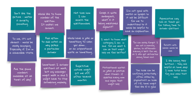
The old app had text overlaid on images and wallpapers making the app seem cluttered and reducing accessibility. Feedback from the research revealed some users simply didn’t like the way the old app looked. Comments included: ‘change the size of the wording’, ‘make the text bigger’, and ‘I don’t like the picture.’ One even said that an image of water was ‘anxiety provoking’.
In addition, the old app was not user friendly. As well as being difficult to read it was hard to navigate, lacked clarity and lacked hierarchy. It didn’t provide appropriate feedback and sometimes made users feel unsure or anxious. One user, during research, said, ‘To me, it’s not obvious (It is) really annoying.’
Parents found the tone of notifications too direct, unfriendly and clinical and therefore not conducive to a user friendly app.
Response: make the app user friendly
We began by adding an all important hierarchy with the right information architecture, layout colour and contrast. We made the new app more visually appealing through the use of icons and labels which aided the user’s experience. This included, for example, the use of colour and visual cues on in-app graphs.
We included help, labels and tooltips in the new app. This made it easier for non-native tech users to use it.
We made the app less clinical both visually and by altering its voice and tone which made it feel friendlier. We also used more favourable greetings and changed the icons and illustrations to make the app more appealing.
Based on feedback from parents, we added motivational quotes to the new app. These were optional and users could toggle them on or off giving them more control.
The option to pause and resume a questionnaire allowed the app to fit better with users’ daily schedules. This was another important aspect in user friendliness and again gave parents’ control over the process.
Challenge: reporting
How do we make graphs and reporting helpful to users? Reporting in the old app caused confusion. Participants found the graphs and results to be unengaging, flat and difficult to understand. They also wanted to add notes to provide context in the future.
Response: visual cues
In the new app, we relied on visual cues which broke down information and grouped it to represent real world conventions. Using colour, labels, titles, a help button and simplified data helped to explain the results better than before.
The addition of the optional mood and notes functionality gave users context when looking at progress. By making it optional, we added another element of control for the user.
Outcome
Corporation Pop presented a supercharged design which was better suited to users’ wants, needs and lifestyles. It was something that was more broadly usable because of its improved accessibility, and far more engaging than its predecessor.
Working alongside an animation agency, and with Careloop Health’s brand guidelines, we delivered a set of interactive wireframes. Accompanying them was a full set of assets, brand guidelines and a visual design so their team could rebuild the app.
Key outcomes
- Improved accessibility which increased engagement
- Research led UX and UI improvements enhanced usability
- Agile workflows increased project efficiency
- Collaborative, transparent approach to project helped it run smoothly
“We appointed Corporation Pop having received a recommendation from a mutual contact. The team were a delight to work with and delivered on time, on budget and above expectation. We are really excited to see the new UI in action.”
Zoe Blake
CEO, Careloop Health