The Covid-19 pandemic impacted health and social care professionals more than could have been predicted. The very people we relied on to help us were themselves dealing with mental health challenges. These were only exacerbated by their daily experiences and the hours they found themselves working.
Dr Jan Smith at HealthyYou wanted to address this escalating problem and commissioned Corporation Pop to design the MindYourself app.
The Evidence
Prior to 2020, between 40% and 85% of helping professionals reported high levels of compassion fatigue or symptoms of trauma. And a study of nearly 2,000 midwives showed more than half experienced burnout because of work and had high levels of stress, anxiety, and depression.
A study examining levels of secondary traumatic stress (STS), compassion fatigue, burnout, and compassion satisfaction in social workers found many experienced significant levels and 40% met the criteria for PTSD.
This sobering data provides a brief snapshot of what the scenario was like even before the Covid-19 pandemic hit.
Effects of the pandemic
Emerging evidence highlighted the impact of the pandemic on healthcare staff who cared for Covid-19 patients. Significant numbers reached the threshold for severe depression, PTSD, or severe anxiety with many experiencing drinking problems.
Some of those in the helping professions were at higher risk of burnout or trauma. For example, in cross-sectional studies, younger and less experienced nurses showed higher levels of compassion fatigue and burnout.
Nurses appeared to have been more affected than physicians — possibly because of their empathetic character and the nature of the caregiver-patient relationship in this field. Ultimately though, no one was untouched by the pandemic, and the full impact on the mental wellbeing of the helping professions is yet untold.
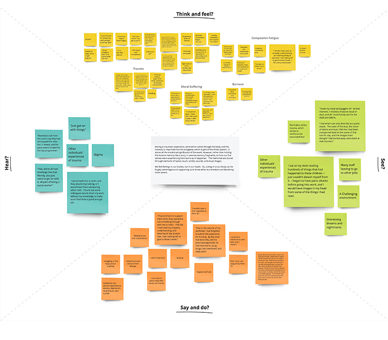
User empathy mapping
Response
Dr. Jan Smith, Research Associate at Sheffield Hallam University, and Founder & CEO of HealthyYou, had developed her ‘Psychological Boost’ workshops. They specifically addressed burnout, PTSD, compassion fatigue, moral injury, stress and trauma and was aimed at nurses and midwives.
During the pandemic, Jan found herself in the thick of it with healthcare professionals contacting her directly for emotional support. Many were overwhelmed, and didn’t know how to cope with the experiences brought about by the pandemic.
NHS England commissioned Jan to deliver her workshops to a broader audience, and she also set up free drop-in support sessions. Even then, Jan didn’t feel like she was doing enough. That’s when she approached us to build the MindYourself app.
Jan wanted to reach a wide audience and offer something easily accessible to health and social care staff. Something that staff could use on the busiest, craziest days — exactly when they needed it most.
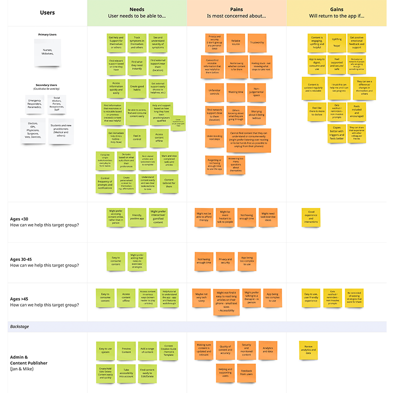
User objective mapping
Objectives
Jan wanted to create a resource staff could tap into to prevent deterioration of their mental health. She wanted users to be able to identify telltale signs in themselves and others. Importantly, she wanted staff to know they weren’t alone, they could get help, and there was hope.
We set about designing an app which would:
- Allow users to identify signs of burnout, PTSD, compassion fatigue, stress and moral injury in themselves and others.
- Allow access to quick and evidence-based ways to manage symptoms before they worsen.
- Provide tools and strategies to help users create and instil good habits which would assist them in the future.
- Signpost users to services so it was easier for them to get help. Whether that be via intervention, treatment, therapy or external support.
The challenge sounded straightforward: design an app that helps users find information and resources easily given their busy schedules.
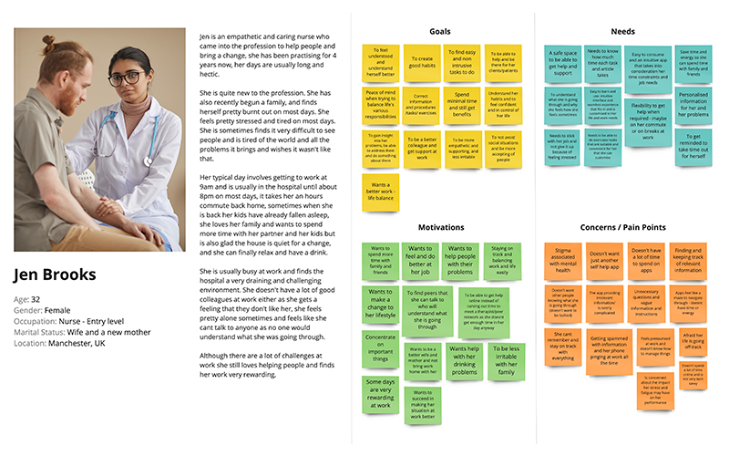
User persona definement
Process
We followed a human centred and lean UX design process to ensure we had evidence to support our decisions. First, we researched which features and information to include then we investigated how the app would be most useful and work most effectively.
Research
Primary Research
We started with a thorough analysis of Jan’s case studies so we could empathise with the user. It was vital we understood their pain points and learned about Jan’s process.
The case studies were eye opening. The depth and intensity of what many staff suffered revealed a concerning impact on the mental wellbeing of the helping profession.
This resulted in high levels of absenteeism, a financial impact on services, substance abuse, and compromised patient safety. They highlighted an increase in defensive practice and resulted in many leaving the profession.
Being able to understand the lives of our users helped us design an app that was simple, intuitive and valuable.
Secondary research
Next we conducted a competitor analysis and found lots of self-help, therapy and meditation apps. They offered plenty of great content and allowed users to consume information in different ways such as audio, video, or exercises.
Some were helpful and well designed (e.g. Headspace, Balance and Calm), but were generic, and anyone could use them. We came across more focused apps such as PTSD Coach, but these were designed for a distinct set of users with different needs to ours.
We were looking at helping a very specific audience — the helping profession — of which nurses and midwives were our principal focus.
Analysis helped identify MindYourself’s competitors, to see the differences in their products and the varying needs of target users. It helped us understand where our weaknesses lay and what our strengths were, so we could focus on areas for improvement when designing the app.
Define
Research revealed many of the users’ pain points, their needs and what they would gain from using the app. Our empathy map and user personas helped put us in the users’ shoes and we gained an understand of their day-to-day lives. We wanted to know what they were thinking & feeling, hearing, saying & doing, and seeing every day.
We categorised users’ pains, gains and needs by age because different age groups might have different requirements and we wanted to cater for that.
With an understanding of users, and the flow of their days, we worked out how our app and interface might fit in. We created a product feature roadmap so we could prioritise features that met the most pressing user needs.
Addressing users’ concerns
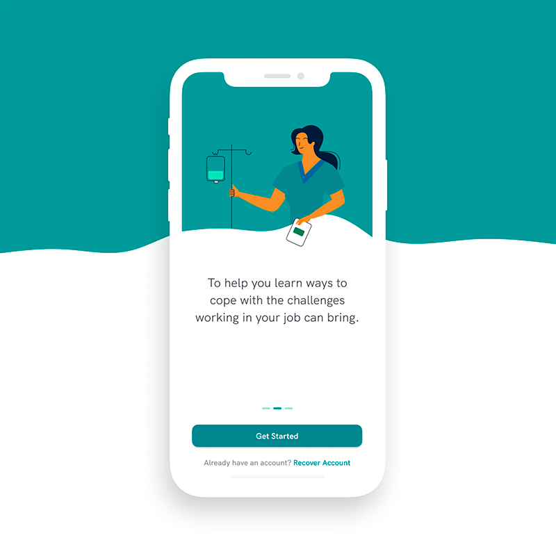
It was important to address the pain points we identified around security, privacy, and ease of use. We designed onboarding to be straightforward with little identifying information asked of the user so accounts weren’t linked to anything else and the app could be anonymous. We prompted users to complete a profile if they chose but there were no disadvantages to not doing so. Users could access the app straight away and we offered them the option of switching on reminder notifications.
Next we addressed managing the time to use the app. Users could set their own reminders which included: on rising; before shift; after shift; before bed; or a custom time. The reminders would help users take time out for themselves when it suited them. Using the app at their convenience made it more likely they’d engage with tools, ask for help, and build positive habits.
The content was tagged and articles and exercises had filters for time and environment. Users could find content that fit their available time: 60 seconds, 90 seconds, 5 minutes, 10 minutes and so on.
Environment filters helped narrow down content based on where they were and they included practice, home, home visit, and commute.
Ideate
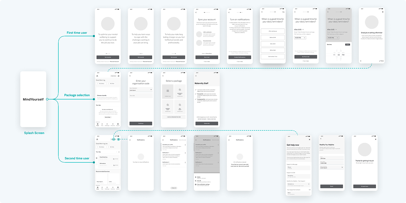
After brainstorming potential features, we created app maps, onboarding flows, and other UX flows.
We considered each section within the app and the tasks the user could accomplish within them.
Following an iterative process, we refined them based on feedback, and speaking with the client. After a few rounds on the drawing board, tweaking flows and information architecture (IA), we were happy we had the best solution for users.
The app would primarily comprise articles and exercises. Articles would help users learn more about the challenges they were facing or get help with a situation. They would help users identify telltale signs in themselves or others. Exercises or tools would help users manage their symptoms with day-to-day strategies or habits they could instil.
The home screen would allow users ease of access to saved tools, their library (saved articles, exercises and past activity), profile, settings, notifications and emergency helplines. Personalised recommendations based on their activity would show up on the home screen.
Sections
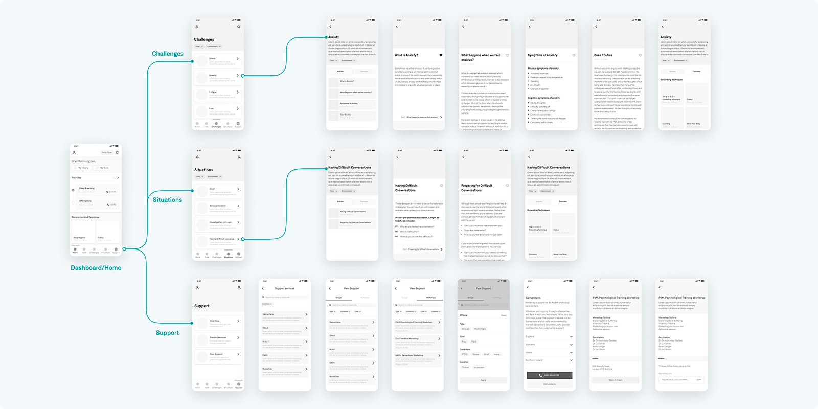
We outlined the four major app sections to be Challenges, Situations, Tools and Support.
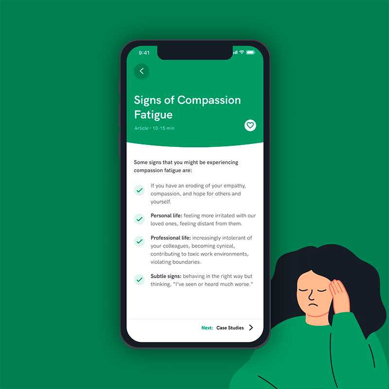
Challenges comprised topics like stress, fear, anxiety, compassion fatigue, PTSD, and moral injury. Each challenge included articles and exercises that would help users understand the the topic.
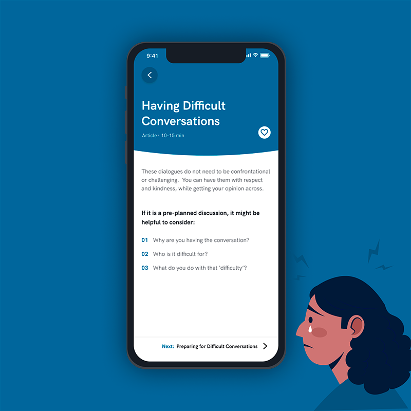
Situations were topics like getting fired, the death of a colleague, bullying, toxic work environments, substance dependence, fertility treatment, and imposter syndrome. Each situation comprised articles and exercises that would help the user understand and manage the situation.
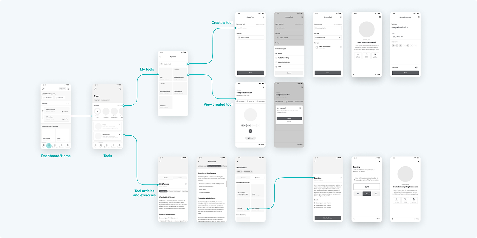
Tools were exercises and strategies users could employ to manage and prevent their symptoms when they were in a challenging situation. Any Challenge or Situation the user was viewing would link them to the relevant tools and they could also access these straight from the Tools section.
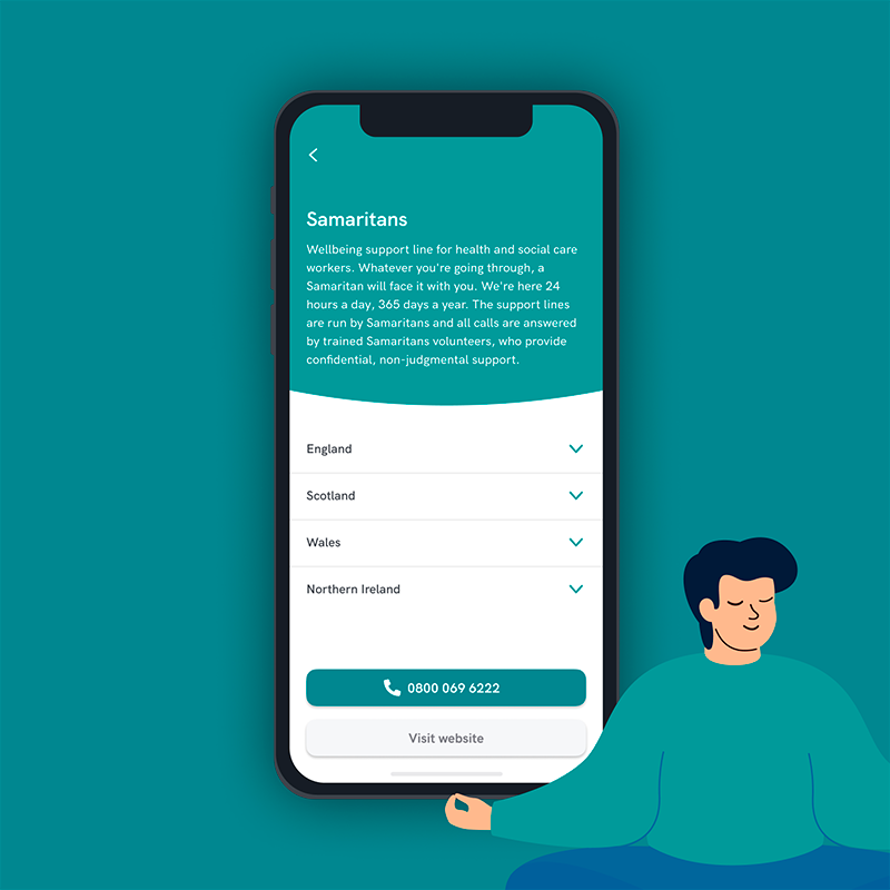
Support helped signpost users to services which included peer support like groups or workshops, support services, or helplines. It made it easy for them to get help via intervention, treatment, therapy and external support.
After rounds of iterations, and having our final flows in place, we moved onto the next phase.
Wireframe prototype
App design template
App section iconography
Design and prototype
Taking onboard the information we had gleaned and the features we’d agreed on with Jan, we designed our early wireframes. We then refined these over several iterations and, reaching a place where we were satisfied with them, created a prototype.
We built a full design system including every user interface (UI) required in the app. From buttons and toggle switches to form fields and drop downs, we made everything available to take forward into a future build.
The design included a primary and secondary colour palette of muted shades with highlight tones, typography, and illustrations for each of the sections. The illustrations reflected the content of the app, so the Tools section which we considered to be hopeful, was given a sun motif, the Challenges section a mountain, and so on.
Delivery
The Corporation Pop team delivered a working prototype called MindYourself specifically tailored to healthcare workers.
With exemplary UX and UI at its heart the prototype was easily accessible, simple to navigate and cheerful thus making the delivery of support effortless.
Our client could introduce the product to sector and industry professionals in order to seek funding for continued development and we hope to work with them again in the future.
UI: 'Tools' section
UI: 'Challenges' section
UI: 'Situation' section
UI: 'Support' section
UI prototype