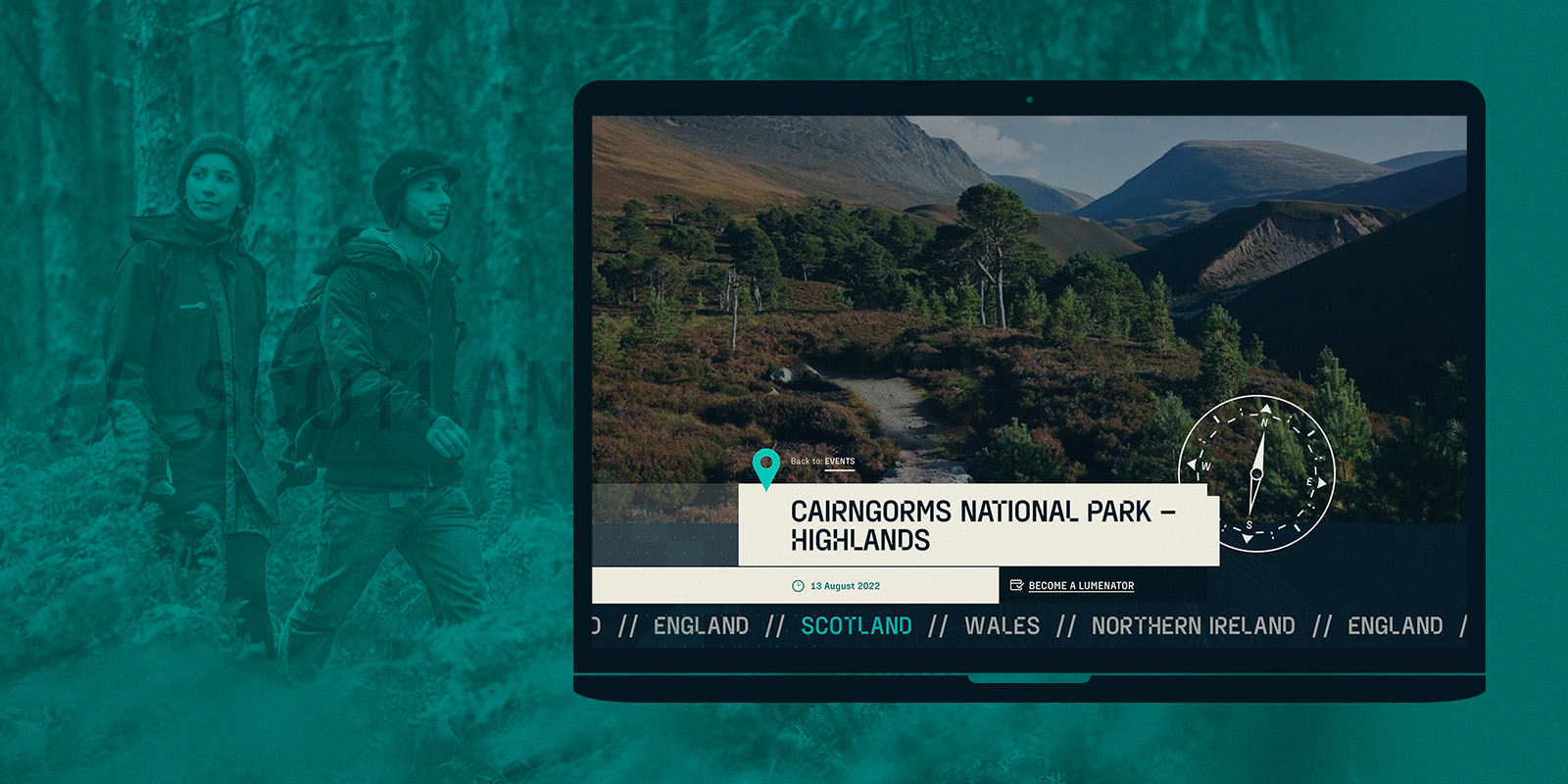
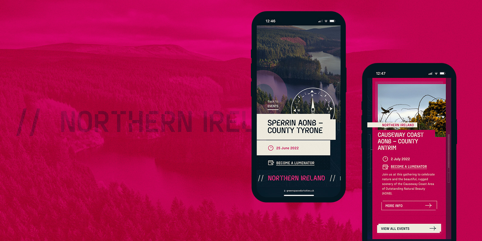
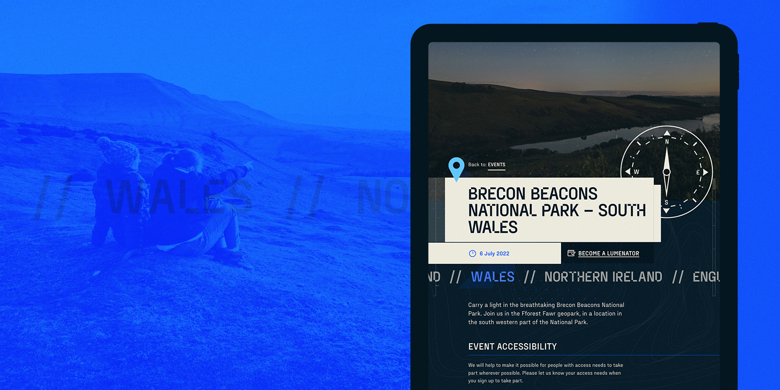
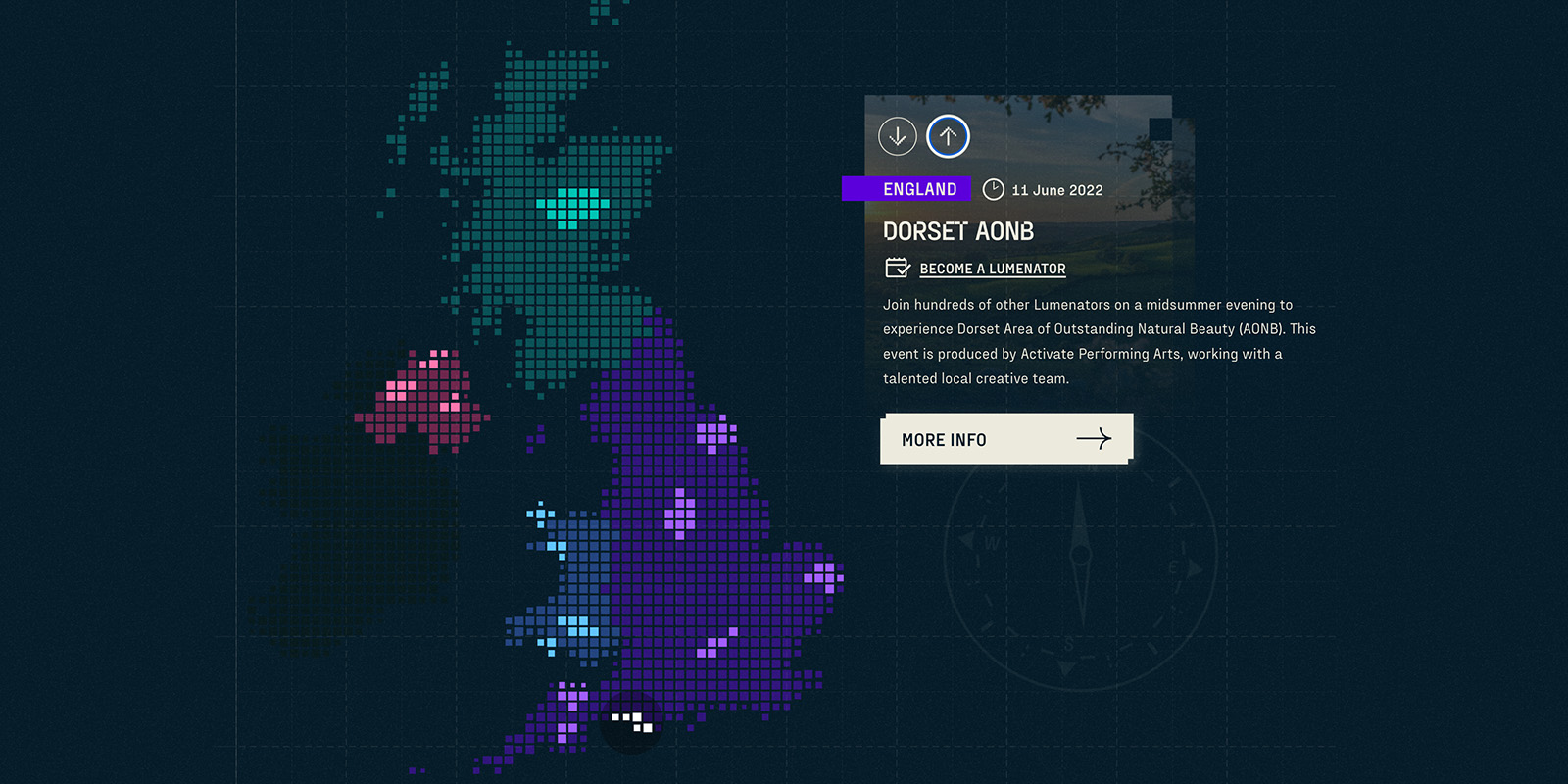
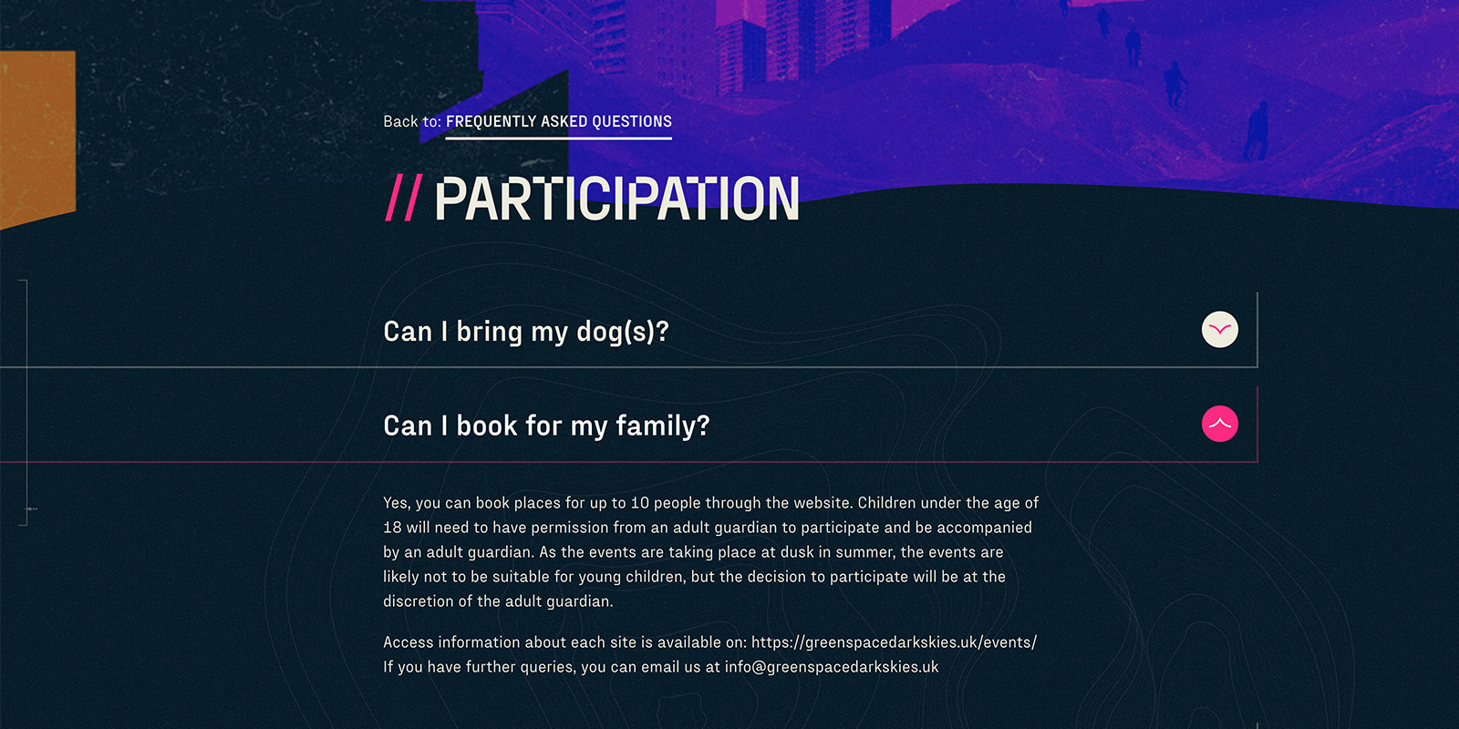
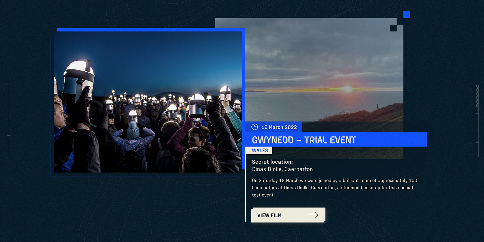
Green Space Dark Skies was a series of outdoor arts events staged in some of the UK’s most iconic natural settings. In 2022, twenty thousand people, from all walks of life, gathered at dusk to create twenty beautiful experiences to be shared around the world. Corporation Pop designed and built a highly accessible, multilingual website to support the project.
As part of UNBOXED: Creativity in the UK festival, lanterns and torches highlighted mountains, lakes and moorland across the UK . Thousands of participants, known as Lumenators, carried low impact lighting across some of the most dramatic landscapes in the country. Then Lumenators and viewers took a journey through our national parks and areas of outstanding natural beauty, where they staged choreographed performances which were recorded for the world to see.
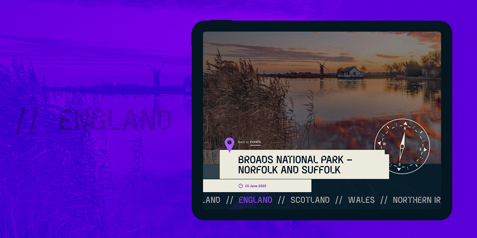
Corporation Pop designed and built the award winning Green Space Dark Skies website. The beautiful multilingual site needed to be informative, hardworking and as accessible to as many people as possible. It was vital the content management system was simple to update. And, finally, it needed to work efficiently with a third-party booking system designed to accept thousands of participant applications.
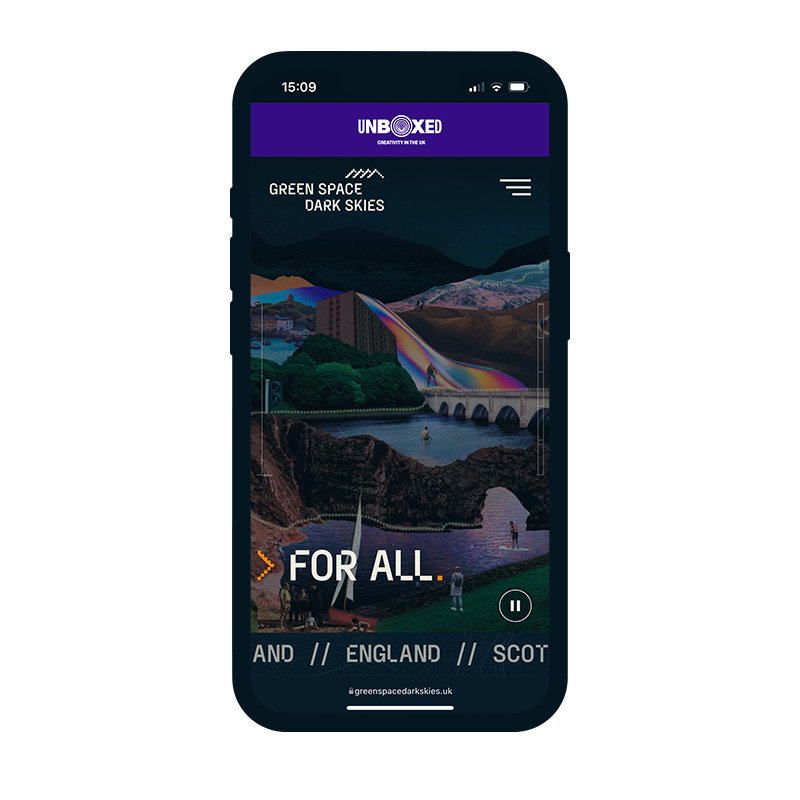
Homepage 'mobile' view
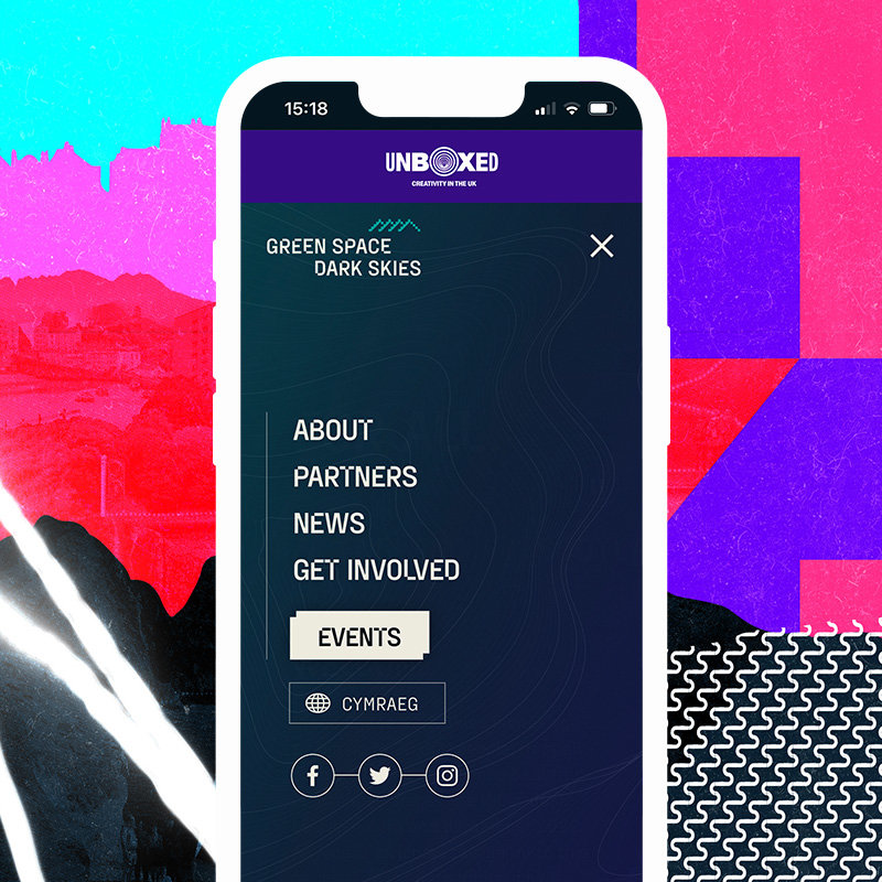
Main menu 'mobile' view
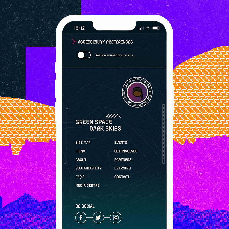
Site footer 'mobile' view
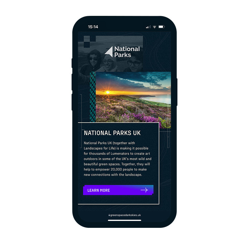
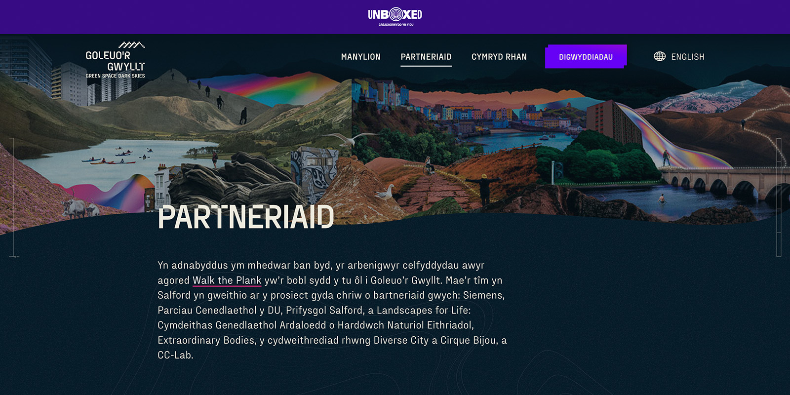
Partners 'mobile' view
Challenge: environmental impact
Organisers planned Green Space Dark Skies to be environmentally conscious. They scheduled events to take place as day turned into night so they had a minimal impact on their environments. The entire project was carbon positive. And that extended to the website, which was monitored and from which they collected data for reporting.
Response: design led the way
Dark (mode) websites have been a popular way of using less energy for some time. Whilst that waned with the increasing popularity of LCD monitors, it’s becoming more relevant again as people move towards OLED screens which light up individual pixels.
It was good fortune for us that organisers had scheduled events to happen as the light faded. It meant a dark theme worked perfectly with the feel and brand of the project. So, for these reasons, we designed the website with minimal use of white.
Challenge: making the website as accessible as possible
Green Space Dark Skies is an inclusive project and open to people from all paths in life. The team behind it wanted to ensure that, as well as functionality, exemplary accessibility was front and centre. Whether that be physical access to the countryside or online access to their website.
Response: going the extra mile
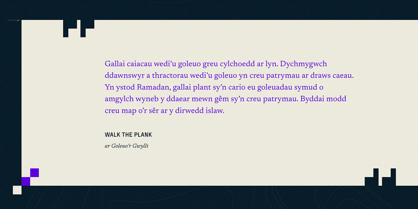
Accessibility is always top of our agenda, whatever the job, but this time we went the extra mile. Markup semantics, font sizes and colour palettes with good contrast ratios are standard for us when designing for accessibility. For this website, we took it to the next level by including a toggle button to reduce or stop animations, enhanced interactive elements for easier keyboard control and providing additional contextual text for screen reader users.
We had the site user tested by a team with a range of impairments and disabilities to ensure it met their needs. We also provided on-going support and best practice advice to CMS editors. So, as the site grows and content is added, the entire team can work towards consistent AA standards of the W3C web content accessibility guidelines.
Inclusive design highlights from the GSDS website showcasing keyboard only navigation of the site and interactive components.
Outcome
The client wanted a website that helped them engage with the British public. We delivered.
The website developed over three stages as the Green Space Dark Skies project transformed through its lifecycle.
Beginning with initial engagement, it encouraged people to find out what was going on and sign up for ongoing information.
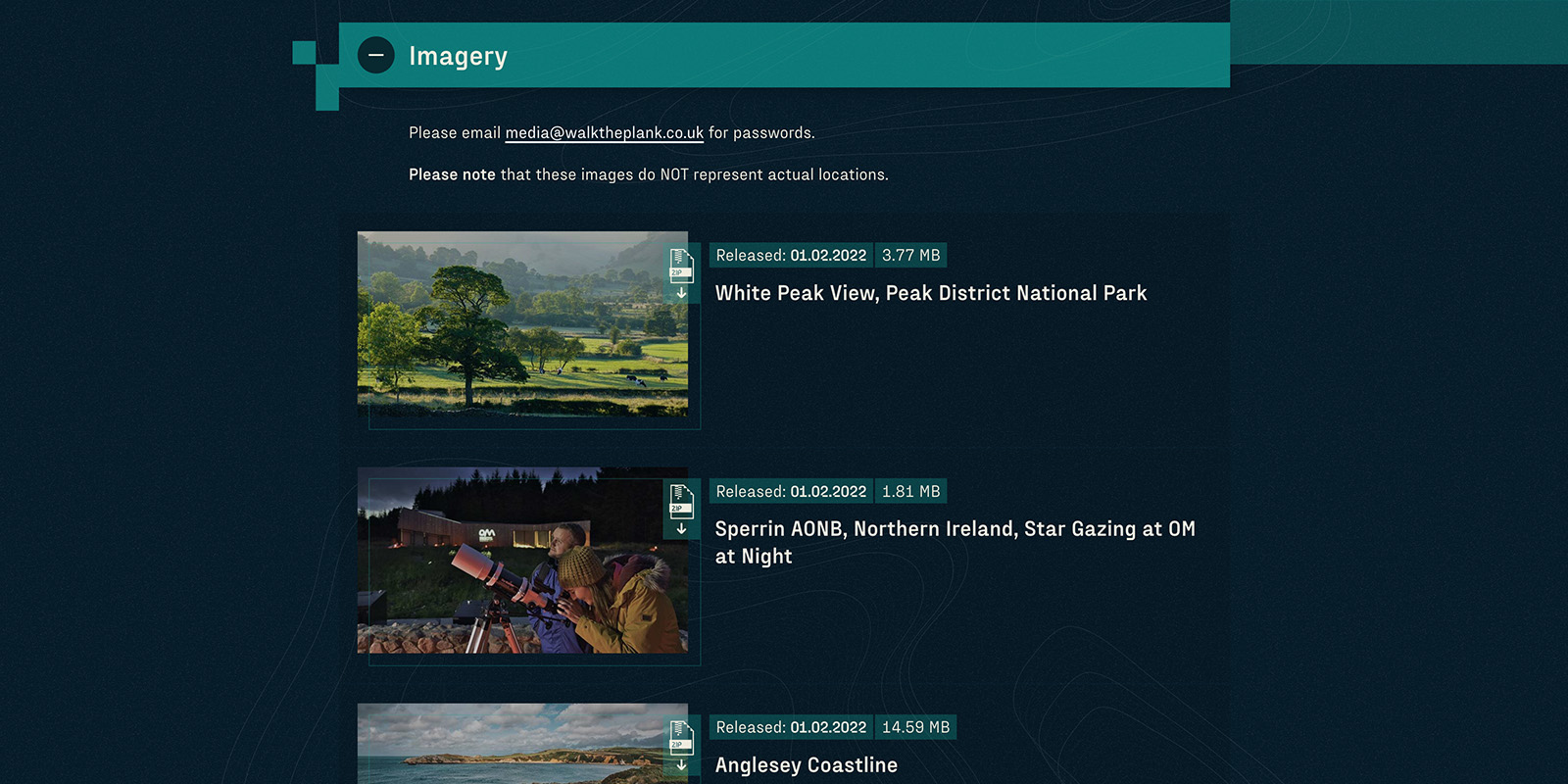
Next the website offered more in-depth content with news, FAQs, a media centre and, of course, information about the events coming online.
Then we linked it to a third party booking system and people began signing up.
Finally, we launched the documentary sections where videos and content of the events are hosted alongside audio used by Lumenators during their performances, photographs, and gathered data and information.
The website is robust, adaptable, accessible and visually impressive. What more can you ask for?
Key outcomes
- Ultra-accessible website gave the client opportunity to engage with as many people as possible
- Energy efficient techniques made the website an integral part of the project’s environmental ambitions
- The website grew and adapted alongside the project
- 2 X Web Excellence Awards winner in the accessibility and cultural categories
“The bottom line is, I would recommend Corporation Pop to anyone and everyone. I hope we can work together again.
Corporation Pop is the best example I have ever met of a team that thinks before they do. And then, when they do, — which they absolutely do, as promised, always— they’re amazing at it!”
Marta Ryan
GSDS Website Product Owner – Walk The Plank
When Unboxed 2022 wrapped up we were delighted to hear the site would be included in The National Archives for posterity alongside 1,000 years of iconic national documents.
So you can still visit the Green Space Dark Skies site and see how it developed over its lifespan here.
