When we think about UX design for wearables, it quickly becomes clear we should take a different approach to traditional web or mobile.
What do we mean by wearables?
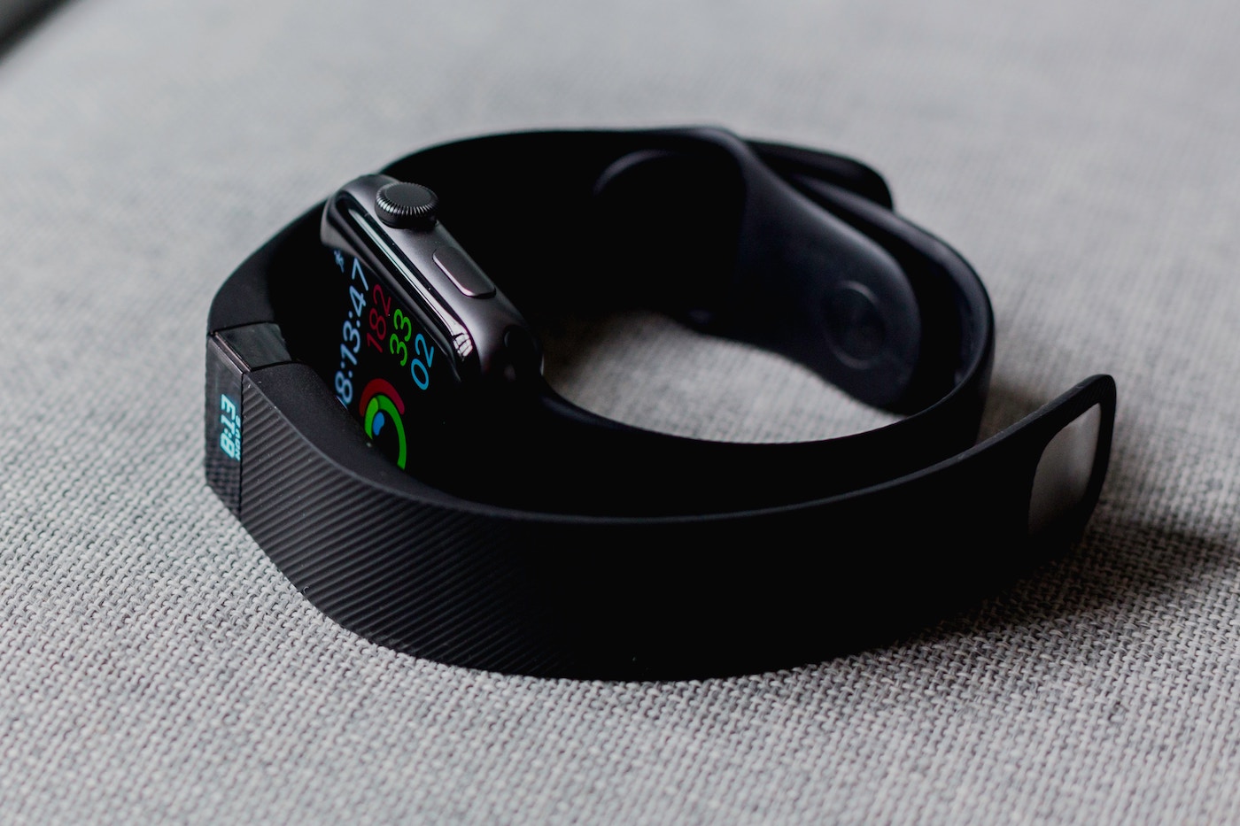
Wearables such as Fitness Bands, smartwatches, VR, Smart Clothing and Jewellery, Smart Earbuds, Implantables and Head-Mounted Displays, and many other new technologies are becoming increasingly available and popular.
Smartwatches and fitness trackers are the most commonly used wearable devices today. They are convenient, the price point is within the reach of many people and unlike a phone, tablet or computer, wearables are hands free and non-intrusive.
They offer a range of solutions, from simple tasks such as telling the time and caller ID, to using VUIs such as Siri or Alexa. Additionally they can keep a record of the calories you’ve burnt and your sleep habits, and measure your pulse, blood pressure and oxygen levels.
Beyond trackers and biometric sensors, specialised medical wearables can help the visually impaired, and memory aids might help people with special needs.
When we design for wearable devices there are some important considerations we must keep in mind.

Fewer Features
Wearables have a smaller display where user interaction takes place and so keeping it simple is important. Since the screen size is tiny compared to other devices, stripping an app to the bare bones of its core features is essential.
If elements overlap, the device will look cluttered and it will be unusable. Too many of them on a small screen makes it difficult for the user to interact with or even view elements.
Contextual menus, actions and content are key. Limiting actions to one or two in the right context helps the user select the appropriate thing at the correct time.
Shorter Interactions
Longer sessions can be effective on the web, desktop or mobile apps, but wearable sessions need to be kept short. If a user interaction takes over 10 seconds, there is probably a need to redesign the interface.
Designers should avoid complicated user flows and architecture with hierarchies deeper than two or three levels as the user might lose their place in the app, causing confusion.
Context of use
Interaction with the device is restricted to a few gestures and you should keep the user’s current activity in mind while designing.
The user might be sitting, lying down, walking or running while using the wearable. If it has a small UI, that has multiple rows of text, it will be difficult to look at since their hand and watch will be moving as they run.
Context is the key ingredient that strengthens design. How is someone going to use the device and how do we present information concisely whilst allowing for glanceability?
Wearables are often accessories for devices
Interaction between wearables and devices like tablets, phones, and desktops has increased recently. Wearables allow the user to perform the basic or core features of an app faster and on-the-go.
Wearables must therefore help reduce the effort and steps required by the user to interact with an app or notification. This frees them from the effort of pulling out their phone to see who is calling, who has messaged or how many steps they’ve taken.
Real Estate and layout
The primary objective of most wearables is glanceability and real estate, or screen space, is valuable. To make interactions on wearables easy, strip back apps to their core functionality.
Design them using simple, large UI elements which allow for enough tappable area by an average-size thumb. This will ensure that the app is usable by most users. Elements like buttons should ideally be big enough to span the full width of the screen.
Legibility
Consider, for example, the Apple Watch’s 40mm screen size. Designing something for a smaller resolution while making everything look legible is vital. High contrast colours, readable fonts, correct margins and paddings between elements are essential.
Use colours sparingly to save battery power, but remember, they should be bright and pop to aid glanceability. Users must also be able to see information under varying light conditions (e.g. while out for a run on a sunny day).
Use bright colours with a high contrast and light colours for the text. Backgrounds need to be in darker colours to make screens less obtrusive and also to use less battery power.
Typography will have a considerable impact on the product. You should avoid sans-serifs and other decorative fonts as they are less legible on smaller screens. Avoid wide fonts too as they may take up too much space.
Grouping
When using margins, paddings and layouts, take into consideration the Gestalt Principle and Law of Proximity. Objects that are close to each other, tend to be grouped together and perceived as one family.
Grouping of similar looking elements helps show association and helps users understand and organise information efficiently. Designers should always maintain visual hierarchy in design. This helps users find the information they are looking for easily. Use negative space or separator lines to ensure elements related to the same group are presented intuitively.
You should left-align content, according to usability principles, because left-aligned text is easier to read. Also, when there are lots of vertical stacks of buttons with text labels, left aligning makes it easier for scanning the information quickly.
Gestures
Consider incorporating gestures such as swiping to fit in more elements. ‘Taps’, ‘Drags’, ‘Tap and Holds’ and ‘Swipes’ (horizontal, vertical, right edge or left edge swipes) can help ‘Ease of Access’. For example, ‘Swipe right to go back’ in Apple watches helps save space for ‘Back’ action in every single screen of the watch, and it is effective.
Micro-animations and haptics
These can help fill in a gap in the experience that a user might be used to. Icon animations, page transitions, button interactions or vibrations for alerts or feedback, which are smooth and subtle, can really help enrich the user experience. Introducing too many of these though, can spoil the experience so balance is essential.
Recovering from unintentional actions
Because wearables are so close to the body, you should account for unintentional interactions. To avoid such errors from occurring, we use gestures like ‘Tap and hold’ to complete critical actions or sometimes, allowances for a simple ‘undo’ action can help.
Inputs
Allowing for a keyboard on such a small device is difficult, and so you should minimise feedback or input requirements from the user. However, if you need them, they could be in the form of dropdowns or select/multi-select.
Where do we go from here?
We’re still in the early stages of the technology, and the potential for growth in wearables is huge.
Because wearable devices are not as developed as mobile or desktop UX, testing is crucial. It’s the best way to understand what people find easy to use, what they enjoy, and how the interactions vary from product to product.
Ultimately, going back to first principles of good UX design will stand you in good stead. After all, the user is number one.
At Corporation Pop we’ve been designing UX and UI forever, and we’re already ahead of the game with wearables. If you’re looking for an expert eye and want to take the first steps into this new tech, then drop us a line.
Get in touch