Corporation Pop created a new brand identity and supercharged the Kompass healthcare platform’s user experience.
Kompass is a tech-enabled healthcare company which is redefining and facilitating excellence in rehabilitation and goal setting for clinicians. In doing so, they are improving patient treatment and ensuring outstanding healthcare for all.
Healthcare software
Kompass (originally Goal Manager) is a SAAS (software as a service) platform designed to co-ordinate gold-standard rehabilitation goals. It is an online platform designed to facilitate time efficient, cost effective and meaningful goal setting within teams. The software encourages interdisciplinary collaboration by allowing clinicians to analyse goal progress with ease, identifying potential facilitators and barriers to the rehabilitation process, and generating automatic reporting of outcome data.
Dr Penny Trayner founded Kompass in 2018 utilising 12 years of clinical rehabilitation experience. Growing frustrations from healthcare professionals with current technological solutions inspired the software.
Goal setting
Previously, goal setting remained a complex and time-consuming process which was difficult to coordinate with busy multi-disciplinary teams. Dr Trayner conducted an extensive review of the literature on best practice. Her findings culminated in a software application designed to take the gold-standard goal-setting processes and streamline them into one system. The software was co-designed with clinicians to reduce workload. It allowed the clinicians to spend more time with clients and less time on administrative tasks. Evidence has shown that the software reduces the time taken to track goals by 43% (Trayner, 2020).
Although conceived in a brain injury service, Kompass’s underpinning processes are universal to any rehabilitation healthcare service concerned with. Kompass is now being used in services across Europe and North America. It helps teams achieve better goal setting for their clients and therefore frees up time to do meaningful therapeutic work.
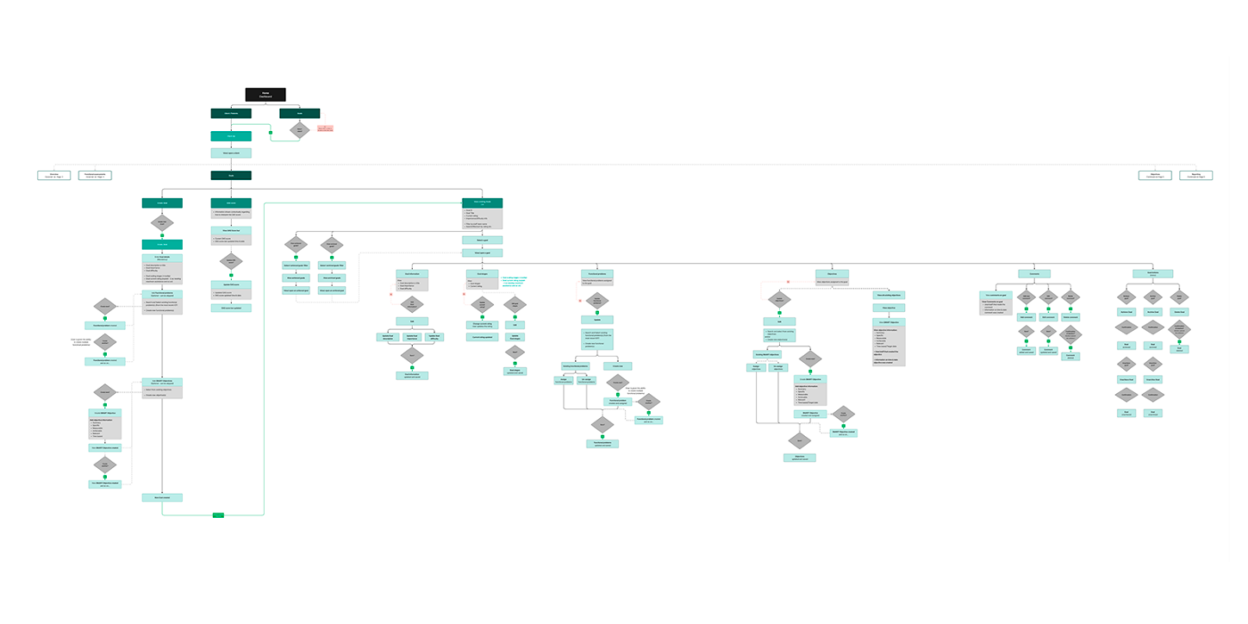
User flow diagram
Healthcare platform
Kompass integrates the World Health Organization’s International Classification of Functioning, Disability and Health (ICF).
ICF assessments are a way of providing ratings based on a patient’s body structure, and functions. They also take into consideration the patient’s activity and participation levels, and environmental factors that might affect their rehab journey.
The Kompass platform allows healthcare professionals and clinicians to create ICF assessments and set goals and objectives. Clinicians set goals using Goal Attainment Scaling (GAS) which allows a patient’s progress to be tracked. This therefore gives clients more motivation to engage in rehabilitation therapy.
Clinicians set SMART objectives (‘Specific, Measurable, Achievable, Relevant, Timed’) to help clients reach goals. Multiple teams can then work collaboratively to help them achieve those goals. SMART objectives better hold members accountable for their short-term contributions to the team’s wider aims.
Kompass allows clinicians to configure data and create reports for funding reviews, multidisciplinary team meetings, or educational healthcare plan updates. It also easily manages client information and calendar events for individuals, as well as content for organisations.


User experience challenges
Kompass had an existing platform, but they wanted to improve the user experience and overhaul the branding. A UX Audit and analysis along with feedback from users gave us a better understanding of how it worked. It offered valuable insight into usability issues and pain points.
The existing platform served a functional purpose, however some users found it challenging to navigate. They recognised, as the company scaled, that these issues would likely be amplified. Some were hesitant to use certain elements and the language and terminology was occasionally unfamiliar. That therefore needed attention. Some users found the ICF a laborious process. Goals and objectives were all on the same page meaning some users found it difficult to set SMART objectives.
Important features, such as reporting, didn’t have enough emphasis and users could easily miss hidden buttons. Navigation could be confusing as the elements changed on interaction and the overall flow of the platform also needed addressing.
Straightforward
We knew we had to make the process straightforward and efficient while providing help and not overwhelming the user. Instead we needed to provide contextual and timely help only when required. It was important therefore to change the hierarchy of the platform completely and redesign the information architecture.
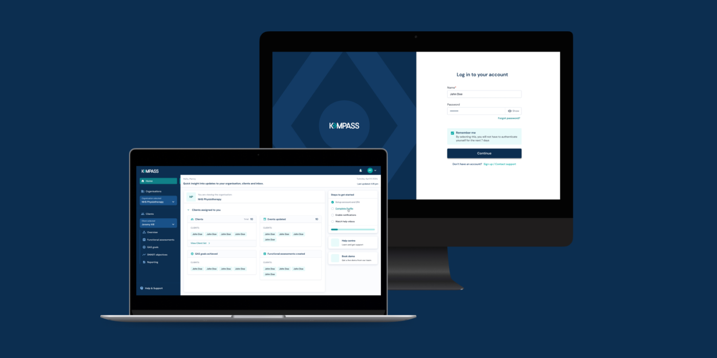
We split goals and objectives into their respective sections, then moved reporting to its own section. We updated the flow where the user would first have to select an organisation after logging in. After which they would get an overview on the homepage into all the information pertaining to the selected organisation. They could then click in to view a specific client and view all client information. They could also then create ICF assessments and create and manage goals and objectives, then generate reports for that client.
Kompass wireframe prototype
Process
Corporation Pop’s UX audit started off with a complete deep-dive into the existing platform. As a result, we learned about the service and platform well enough to make meaningful changes and updates.
We followed this with secondary research — competitor analysis — although Kompass was a unique product and had no direct competitors. This step provided a lot of valuable learnings.
Next we conducted a thorough UX Audit that analysed the existing platform. It pointed out all its usability issues and helped us understand the changes we needed to make.
We then undertook primary research with users to validate our findings. This helped us gain further insight into what the users thought about the platform.
Next we conducted a card sort to validate and form the new platform’s Information Architecture. This improved the hierarchy of the product.
Taking these insights into consideration, we started off by creating a product feature map. We then made a prioritised list of all the features the platform would include and followed with a red route analysis. Next we designed a site map, which on approval, meant we could create user flows of the portal.
The user flows helped map out the entire platform and helped the clients visualise it better. Once the client approved them, we worked on the wireframes which we designed iteratively.
Kompass brand logo design (with visible grid alignment)
Kompass brand logotype
Brand identity
Alongside the UX, we started working on developing the brand identity. The first step was to come up with a new name for the company.
‘Goal Manager’ was outdated and hence didn’t represent the product in its entirety. There were also trademark protection issues due to the fact the name contained a verb.
After coming up with an exhaustive list of almost 500 names, we narrowed down on ‘Kompass’ (derived from a compass). We felt Kompass best represented what the product was all about — guidance and direction on the path of goal attainment and navigating the complex path of rehabilitation.
The logotype for ‘Kompass’ uses figure-ground to create an “invisible” compass needle in the ‘O’ of Kompass. The needle symbolises direction and guidance.
Logomark
We also produced a logomark comprising only the Kompass needle, to be used in marketing collaterals such as stickers. The intention being that the logomark and logotype will never appear together.
The colour palette was a dark blue paired with a refreshed green, used as an accent colour. We took the green from the original palette and tweaked it to pair with the primary dark blue colour. The palette we created was AA accessible.
Once the brand and colour palette were finalised, we then started working on the UI of the platform. We created a design system for Kompass to use. It included the colour palette, typeface, UI elements and their various states in a component library. It also included buttons, input fields, and other UI features. All the UI pages of the platform were then modular, and we built them using these components.
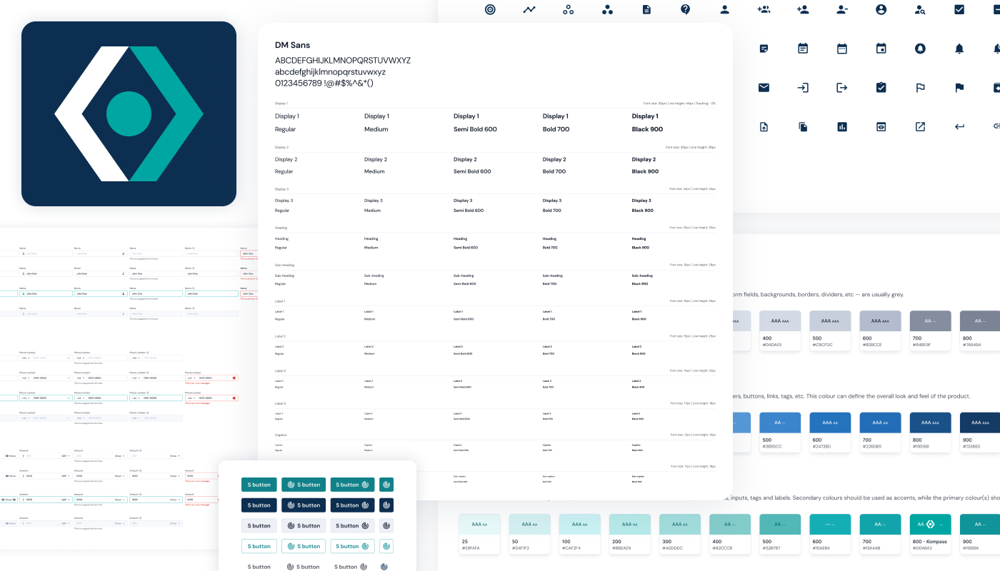
Kompass design system
New platform
The new Kompass platform holds great promise for improving the way clinicians create and manage clients’ rehabilitation goals and objectives. By providing a structured framework for setting SMART objectives, Kompass tailors rehabilitation plans to each patient’s unique needs and circumstances.
One of the key strengths of Kompass is its user-friendly interface. It allows clinicians to input and track patient data easily, set goals and objectives, monitor progress and generate reports. The ability to collaborate with other healthcare professionals and share patient information seamlessly will streamline the rehabilitation process. This in turn leads to improved communication and continuity of care.
Furthermore, the data-driven approach of Kompass enables clinicians to make more informed decisions based on objective measurements and progress tracking. This not only enhances the effectiveness of rehabilitation but also provides valuable insights for continuous improvement and refinement of treatment.
While there will be a learning curve for clinicians adopting new technology workflows, continued training, along with iterative refinements to the Kompass interface based on user feedback, will further increase adoption and maximise its potential benefits.


The future of healthcare
The healthcare industry continues to embrace digital transformation and value-based care models continue to emphasise measurable outcomes. Platforms like Kompass, that facilitate collaborative, patient-centred goal setting, are therefore well-positioned to make a significant impact. Kompass is poised to play a crucial role in delivering personalised, efficient, and evidence-based care to clients undergoing rehabilitation.
Kompass’s ability to translate rehab goals into specific, trackable objectives is a key enabler of more effective and accountable care. With its innovative features and user-centric design, Kompass has the potential to become a game-changer in the field of rehabilitation. Kompass empowers clinicians to provide better care and improve patient outcomes.