After almost a decade, We Are FSTVL’s brand had lost its way in the increasingly competitive music festival market. Visually, it had veered off course and no longer represented the event it was supposed to support. New owners, VW Music, commissioned Corporation Pop to shake things up and realign the brand with their vision for the product.
For their tenth anniversary we went back to the woods, discovering the roots of the festival, and delivering a reinvigorated campaign presided over by a mythical creature.
Essence of the brand
To turn around the tired brand, we needed to take it back to its origins and rediscover its essence. We Are FSTVL has long been associated with contemporary dance music, particularly techno. The music is cool, the DJs are cool, and the crowd is cool. We needed to tap into that, so we started by plunging into the archives to discover the brand’s roots.
Back in the day, the festival had drawn on imagery and symbolism associated with ancient woodlands. It married the mystery of mythical creatures with the mesmerising beats and the electronic sounds of the music. We took those influences then imagined a new animal, one with the body of an owl, the horns of a stag and the claws of an eagle.
Logo
Next we got to work on the logo. Over the years it had been revised so often it had lost all definition. Its now rounded fonts and sweet shop colourways resembled a neon sign outside an eighties nightclub. It was utterly off brand, so we gave it a good shake, dismantled it, and built it back from scratch. The updated logo, whilst still immediately recognisable, was now stripped back, edgy and representative of the festival’s music and attitude.
Brand logo design (with visible grid alignment)
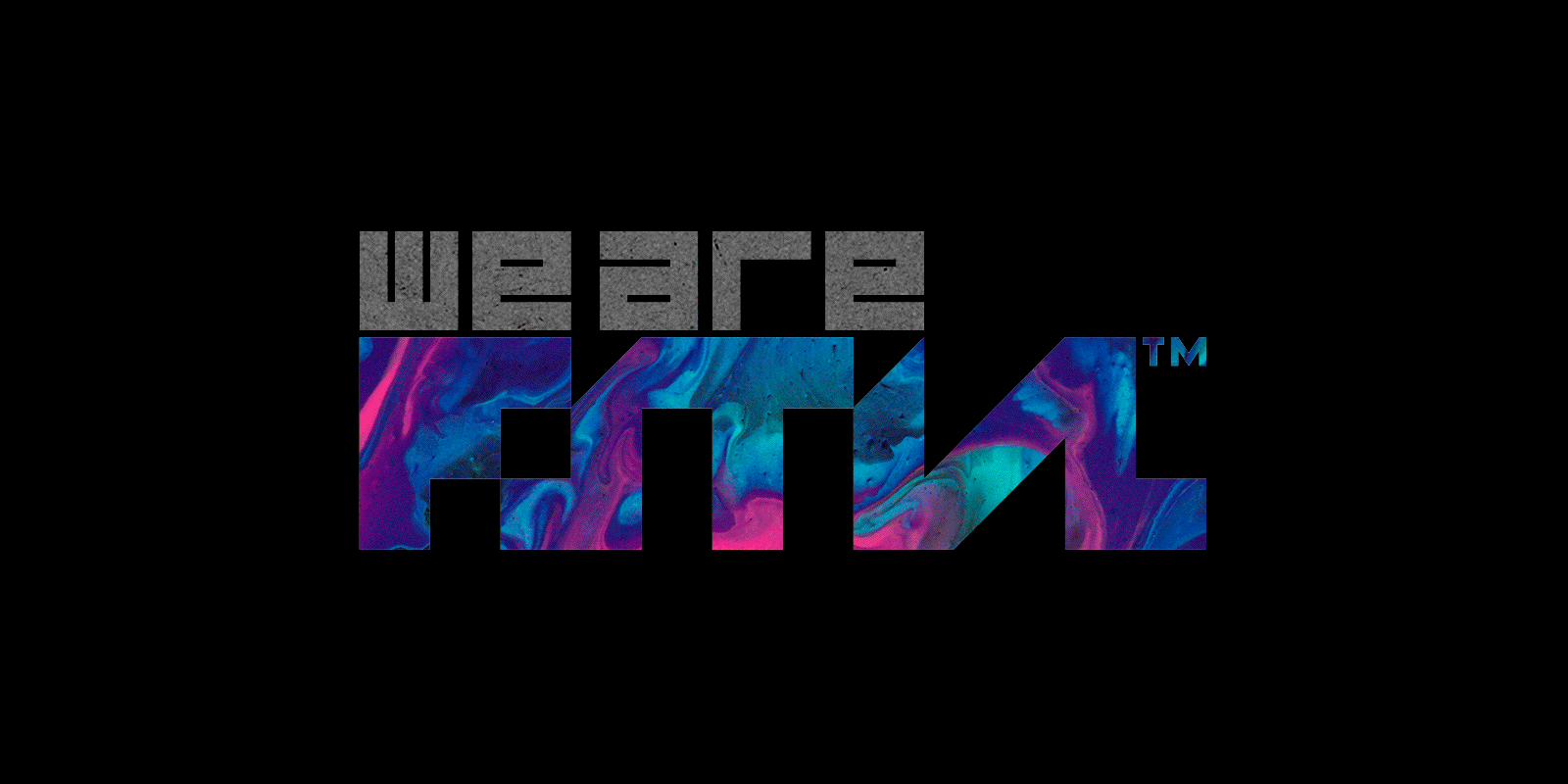
Logo brand design
Campaign
The night owl formed a centrepiece for the brand and was first launched as part of a print campaign. For miles around the festival’s Essex site, billboards and posters appeared. Each had the creature emblazoned across it, and nothing else. No name, no dates, nothing — just this striking image of a mythical woodland animal. We used glow-in-the-dark ink for its eyes to add extra night-time impact and it did its job, it got people talking.
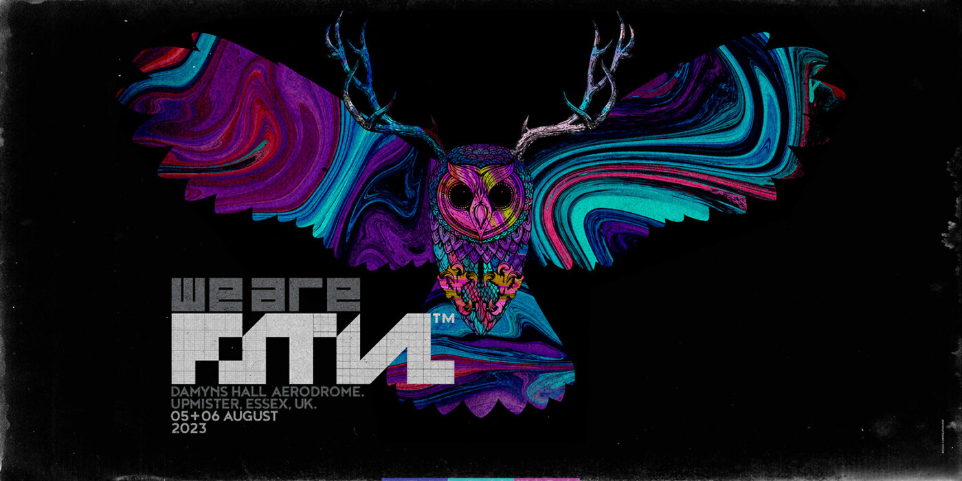
Campaign (billboard) teaser launch asset
Relaunch
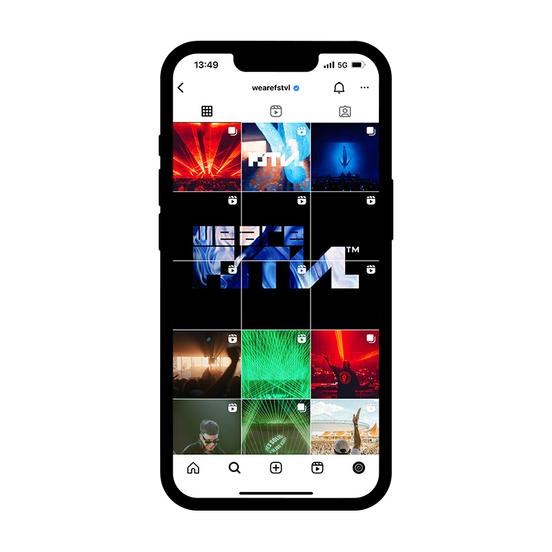
We wanted to tease an imminent change then hit the audience with the power of the new brand. So, to do that, the social media team cleared down a decade’s worth of images. They deleted every back catalogue photograph ever posted on Instagram and Facebook, and then the rumours began.
Shortly afterwards, we relaunched the brand. The logo hit social media, then we revealed the website’s new look. Simultaneously, we extended the poster campaign finally uniting the logo and the night owl.
The power of the campaign reverberated across its audience and caused a commotion in the festival community.
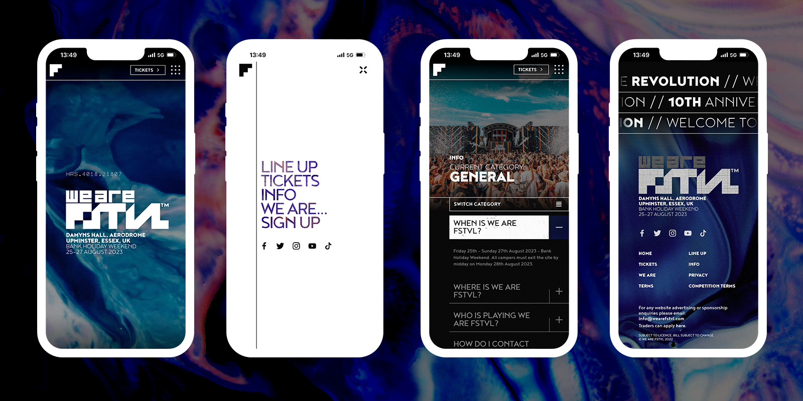
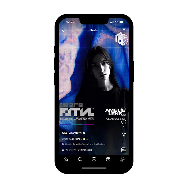
Website: mobile view(s)
Creative direction
Corporation Pop managed the creative direction of We Are FSTVL, both online and offline in 2023. The campaign continued to grow and develop through the year as they headed towards the August bank holiday event.
All early bird and first release tickets for 2023 sold out. The campaign was received well with high praise from festival goers, artists and the industry as a whole. And importantly, our client, VW Music, was thrilled with us.
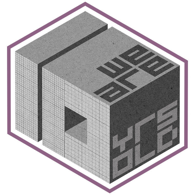
A decade of music festivals
As part of the tenth anniversary celebrations, we designed a key milestone asset for use in the campaign. We took the logo and combined it with a cuboid number 10 in order to create an additional 3D animated logo lock.
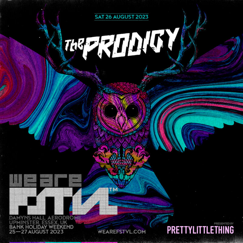
Headliner social asset
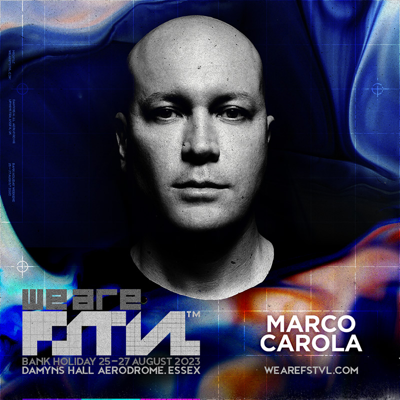
Artist social asset
“Corporation Pop is hands down one of the best agencies to work with in the country, if not internationally, be it on creative branding, web development or motion graphics.
The team raised to the challenge of the brief delivering a campaign concept that will set the festival’s brand tone for its 10th anniversary and the years ahead.
I place the credit firmly on the team’s hard work, creativity, and ability to meet a demanding brief. Corporation Pop offers a quality of service that is always delivered across the team, no matter who you are working with.”
Laura Buckley
Group Marketing Director, We Are FSTVL